Two New Stickers

I added two new stickers to my shop this week.

The first one is a line I saw from a friend a long time ago. It’s always a line that has stuck with me growing up as a woman in this world. This is the first time I’ve opted to try for a glitter border too and I think it turned out pretty cool. The sticker is 3x2.5 inches and durable vinyl.

The second sticker is a quote I read a while back from author Glennon Doyle and it’s one that I really relate to.

I will have plenty of these stickers in my booth at Draper City’s Art in the Barn on August 25 and 26 and possibly Draper’s Int’l Arts & Crafts Festival too.

Also remember that any sticker purchases include a free 2x2 inch circle sticker of Sundial Peak. You can read about that one here.
Three New Stickers

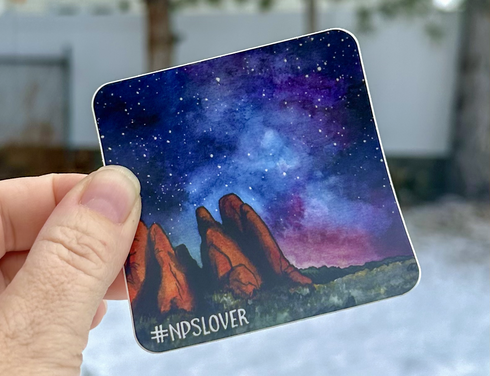
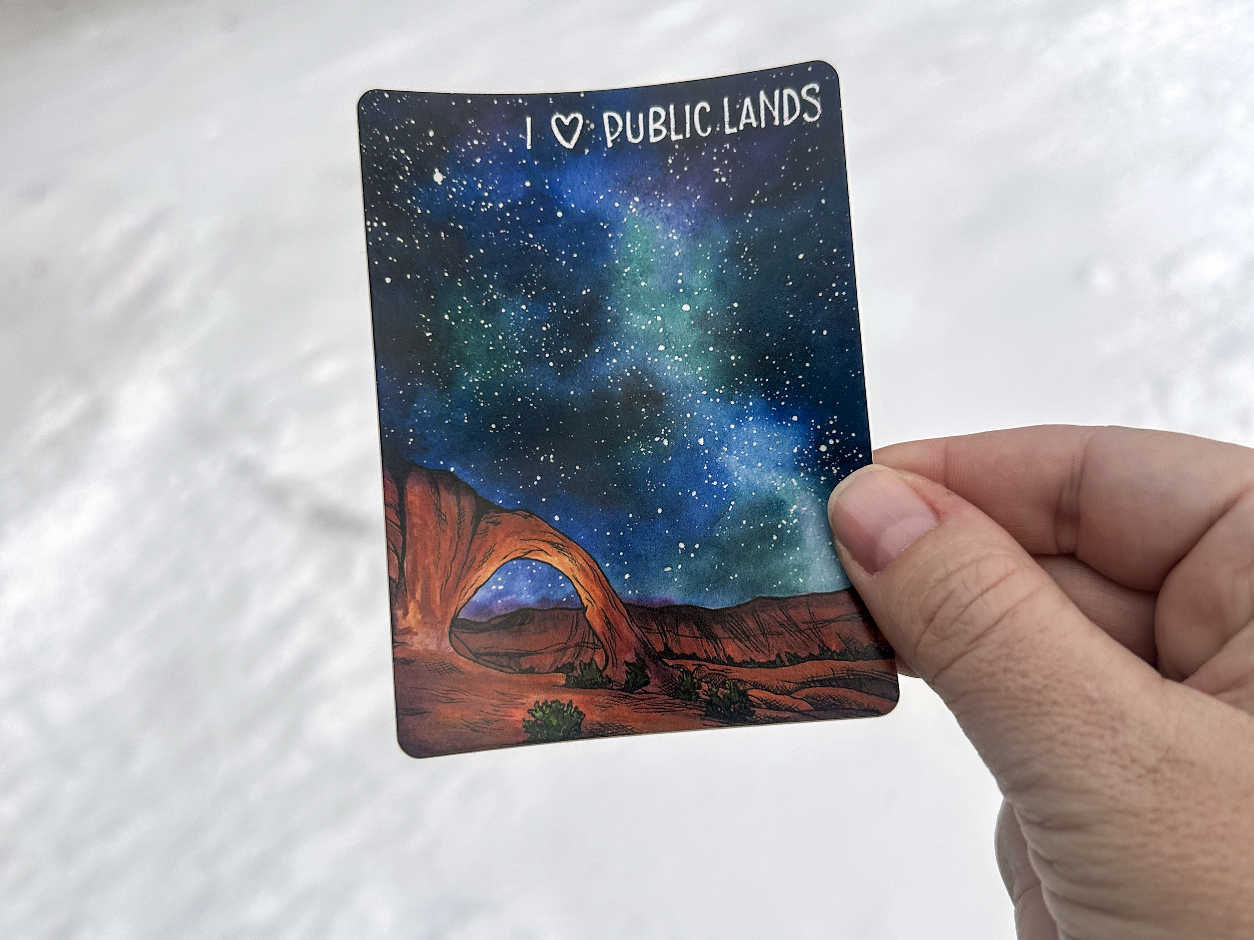
I added three new stickers to my shop this week. Click here to buy, share, gawk, critique, you know the drill. My #NPSLover stickers are listed first with my I ♥ Public Lands sticker right below them.

Up first is the painting I did last summer of the Milky Way over Sand Dune Arch at Arches National Park. I painted this during the weekend I spent at Draper’s Art in the Barn. It was a 2-day art exhibition (my first ever!), and I found it impossible to just sit or stand while people milled about, so I brought supplies to paint and ended up doing 3 small paintings.

Sand Dune Arch was a favorite spot of my kids when they were younger and didn’t much care about the awe of the park. Hike for just a few minutes in between these giant fins of sandstone and there’s an arch in there; it’s super short. It’s a wonderful spot to let little ones play in the fine sand and, depending on when you get there, you could rest in the shade. This spot can be super popular in the summer months when it’s hot. We’ve been to Arches multiple times, but only in April and May; which I HIGHLY recommend. Spring Break is a wonderful time to visit Moab.

You can click on the image to purchase a sticker too.

Next up is a painting I did of Corona Arch, just outside of Moab. It’s one of my favorite places ever and I did this painting for a client a while back to be printed on neck gaiters some day. For this sticker, I went with a new-to-me website, Jukebox Print, for these stickers and I LOVE how they turned out.

This is one of my favorite paintings and I had SUCH a fun time painting it. It was one of those times where I felt like I was in a groove and paper and paint just cooperated and coordinated.

Last up is Sundial Peak in Big Cottonwood Canyon and part of the Wasatch National Forest. I had to do some research to find out if this peak was on National Park Service land or BLM Land. I’m still not 100% sure, because I also see it tagged in the Twin Peaks Wilderness. This spot is close to where we live and it’s a hike I hope to do this summer. If I can plan it right (depending on snow melt and weather, we’ve had a TON of snow this winter), I want to do a backpacking trip there. It’s a tough trail with a lot of elevation gain, but it’s supposed to be worth it… barring the mosquito situation.

I painted this one just last month to help pull me out of a funk I was in. Finishing it, and subsequently making a few changes in Photoshop, really helped pull me out of my Winter Blues and the funk that I was in. I will have this available as a giclée print in a couple of sizes in the coming months.

I actually made a mistake when ordering this one as stickers. I didn’t pay attention to the wording on a sale and I ended up ordering 2x2 inch stickers. These are a lot smaller than I usually order, so I may just make these freebies to anyone who places an order.

I will order this in a 3x3 inch sticker at some point.

I want to paint some places that are gorgeous and not in Utah next. I have a few spots on my list like South Falls in Oregon, and I have a photo that I took of a beach in Half Moon Bay, California that I may paint. Any suggestions??

4-Day Galaxy Skies Challenge

As part of my effort to light a fire under my butt to paint more often, I decided to participate in a 4-day galaxy skies painting challenge that I saw on SkillShare with artist Swathi Ganesha. Click here if you’d like to try a month of SkillShare for free.

Day 1: Monochrome

Day One was a monochrome painting, so just one color. I chose Phthalo Blue from Daniel Smith Watercolor and went to town making a basic diagonal edge to the Milky Way. There was something very freeing about doing all I could with just one color. Click here to watch a time lapse of this painting. A couple of tiny mountains at the bottom added some depth to this one.

I painted the stars using white gouache paint and a splatter method where I tap two brushes together. This is a method I used a lot when I was doing galaxy-dyed shoes and baby carriers a few years ago. I would use acrylic paint and it gave the most awesome and varied sizes of stars, but I had very little control over where they landed, and sometimes I’d end up with an odd-shaped glob of paint that wasn’t round. Also, paint ended up everywhere! Those reasons are why I originally used masking fluid and white pens to make stars for my watercolor paintings, but after using this splatter method again, and with gouache this time, I think it’s going to help me level-up on my galaxy stars.

I have an awesome set of gouache paints from Himi that my sister gave me for Christmas.

Day 2: Duo Chrome

Day Two was Duo Chrome, so two colors. I opted for Phthalo Blue again and added Quinacridone Rose. I haven’t been using very high quality paper for these; just a 4x6 pad that I got from Michael’s. Today the paper bowed down the middle when it was saturated and the paint was pooling along the bottom. I managed to dab the puddle with a tissue in an attempt to salvage it, but I almost tore it up and threw it away. Once I added stars, the painting redeemed itself.

I added a few happy trees and I was happy with how it ended up. Click here to watch the time lapse of this one.

Day 3: Three-Color Seascape

Day three; a three-color seascape, proved to be the most challenging. I have a palette of watercolor from Culture Hustle that I tried to use for all three colors. The lavender and turquoise just weren’t pigmented enough. So attempt one went into the trash. With attempt number two, I tried to use Phthalo Green straight for the aqua shade along the bottom, but it was way too green and I scrapped that one too.

For attempt number three, I premixed that aqua color using Phthalo Green and Cobalt Blue. Then I used Imperial Purple and the bright pink called Runaway from the Culture Hustle Watercolour Palette. I absolutely hated how the colors were coming together when they were wet. But once it dried and I added stars, it was worth saving. After adding some more definition in the ocean at the bottom, it avoided the recycling bin.

Click here to watch a time lapse of this painting.

Day 4: Dreamy Landscape

Day four was fun because I could use pretty much anything I wanted. I chose to limit myself to only four colors: Indigo, Moonglow (that purple shade), Phthalo Green, and Cobalt Blue. These colors are more muted than the ones I used before, but I still love how they turned out. This time the paper was cooperative and I was happy with how the paint behaved. I tried to be more patient and waited longer after applying paint to see how it spread and I think it paid off.

I opted for a few more happy trees and I love how it turned out. Click here to watch the time lapse of this one being painted.

I had such a fun time with this challenge, maybe I’ll do it again next week but with all different colors. Maybe if I can paint enough of these little paintings, I can have them for sale.

Milky Way Over Sundial Peak & Winter Blues

Sundial Peak Watercolor

There’s something to be said about noticing when you’re in a funk and acknowledging that it’s okay and just rolling with it. I first noticed it with my kids. We’re all cranky and mornings are tougher than usual. I told them both that it’s normal for this time of year. The holidays are over, it’s cold, it’s dark, and spring and summer feel a million years away. It feels like there’s nothing to look forward to like we had in November and December. My kids and I have deemed it the Winter Blues.

*Not to be confused with actual depression. Seasonal depression is real too, and I dunno, maybe I get a touch of it this time of year?

Somehow, acknowledging that we’re all feeling it made it suck a little less. We are hanging in there and simultaneously enjoying the snow we’re getting and also anxious for spring to get here.

Last week I realized I hadn’t done any painting since the end of December. And before that, I hadn’t painted since August. I had no motivation or inspiration; which sucks because I live in such a beautiful state!

Imposter Syndrome loves these moments and chimes in with little tidbits that sound like, “you aren’t skilled enough to paint that,” “don’t even start painting that, you won’t finish it,” and the ever popular, “paint that and everyone will learn how awful/fake/not-a-real-artist you are.” She’s a sneaky bitch.

Last summer, during one of my weekend shows, a guy asked how I made the stars on my Milky Way paintings. I told him that I was trying out different techniques as I went; some I used masking fluid, some I used white ink, some I used both. He commented that on a couple, it was hard to tell if I was going for stars or snow. I took no offense because his comment came from a place of pure analysis, but it did make me think. A few of my paintings are small, 8x10 or smaller. So when I’m using masking fluid, it can be more challenging to paint smaller stars if; especially if I’m just flinging masking fluid off of a brush.

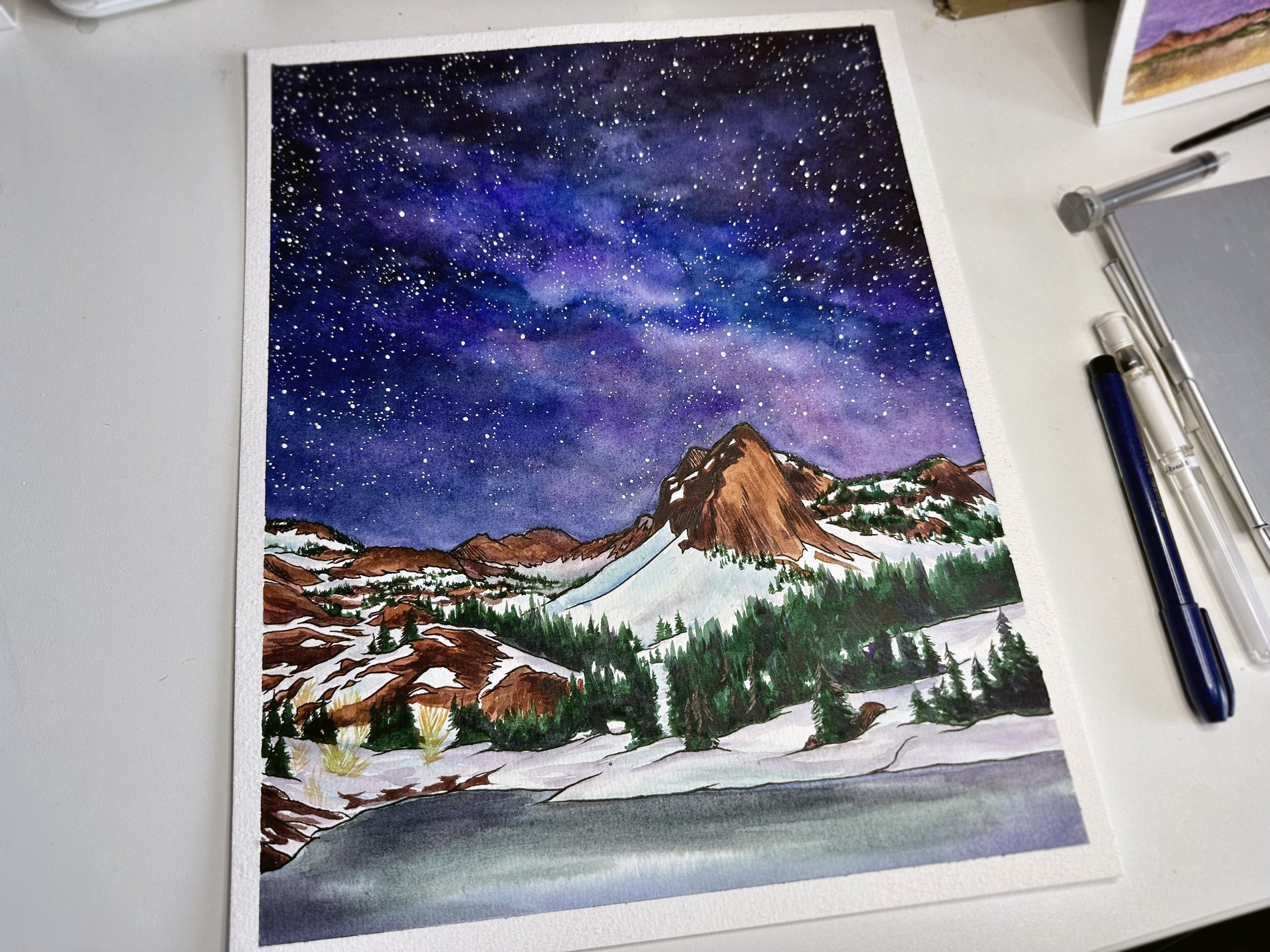
One such painting was this one of Sundial Peak and Lake Blanche. This is a local mountain to me and one I am hoping to hike or backpack to this summer. The first time I painted it, I used masking fluid to make the stars. I splattered it on the page and then erased it off when the painting was done. It acts similarly to rubber cement. This original is maybe 8x10 inches, and I didn’t have the patience to make smaller stars by using a tiny brush and doing one at a time. You can watch a time lapse video of how I made this painting here.

I wanted to repaint this mountain on larger paper and see what I could come up with. This version has a bit more snow, more sky, and less of Lake Blanche. I skipped using masking fluid this time and made all of the stars with white pens.

This one took me more than a few days. I would paint a small part and step away for a day or two before coming back to it. I wasn’t thrilled with the mountains, feeling like they lacked some depth. Then I wasn’t happy with parts of the sky; the blues not inky enough. I wasn’t sure how I wanted to show the little bit of Lake Blanche that shows at the bottom. The reference images I had showed dark green spots where it was iced over.

I overthought this one a lot. Heck, I still am. I already know a few spots I want to change in Photoshop; like that stripe of snow down the middle that I didn’t intend to go almost perfectly vertical, LOL. I’ll scan this one and make it into prints and stickers…. after I’m happy with it.

Here you can watch the time lapse of how it was made.

Here’s a list of the supplies I used; including links. Some are affiliate links.

…and the desk lamp that also holds my iPhone so I can make these cool videos.

What should I paint next?? I really want to paint locations that are outside of Utah, but I don’t love painting the same views of the most popular spots that everyone takes photos of. I kinda want to continue with public lands and National Parks too. Decisions…

Valentine's Day 2023

Valentine’s Day arrived this year and my youngest son requested basketball-themed valentines for his school party. For the last few years we have strived to send non-food, non-candy, and allergen-free valentines for school parties, in support of my nephew who has a lot of food allergies, and this year was no exception.

I found these basketball pens on Amazon and they came in a pack of 24. Of course, we only needed 30, so I ordered two packs.

We headed to Pinterest for ideas for cute things to put on cards. And we’re suckers for a cute pun!

Basketball Valentines

Next I made these simple basketball cards in Adobe Illustrator. The back just says “Love," and my kid’s name on the same basketball image. I printed them on my home printer onto card stock and cut them out with a 2.5 inch circle punch. The punch I have is Martha Stewart’s brand and it’s an awesome punch, but it’s been discontinues. Here is one from Fiskars that will work great. FYI, a 2.5 inch circle fits perfectly on a wide-mouth mason jar lid.

I attached each pen to a tag using some washi tape that I had to buy because I’m not a frequent user of washi tape. I found some food-themed tape on clearance at JoAnn’s.

In hindsight, I just should’ve used clear tape because at times the washi tape covered up some of the words.

Here’s a breakdown of the cost of this year’s valentines:

  • basketball pens - $20.98/pack of 24

  • washi tape - $5.99 for 8 rolls from JoAnn’s, on clearance

  • card stock - already had

  • printer - already had

At the end of the day, each valentine came to just under $1 each.

I have a love/hate relationship with printers. After owning and working with printers from Canon, Epson, Brother, Xerox, and HP, I always end up with HP because the print quality and color management has always proven to be closest to what I see on my calibrated monitor. Right now I have an HP Envy color inkjet printer. The print quality is okay, but nothing compared to a HP photo printer I had years ago (I STILL miss that printer). But ALL printers have their moments. Mine currently doesn’t want to connect to my desktop computer, it will only print from my phone. ::massive eye-roll:::

Here you can read about valentines I have created for previous years.

Does your family celebrate valentines day? If so, what traditions do you follow?