Cari has been a dear friend of mine for more than a decade and, funny enough, we were friends long before we ever met in person. We “met” on an online, wedding-planning forum. We got married within a few months of each other and formed a friendship with a large group of women. She started her photography business shortly after her wedding and she asked me to design a logo and branding for her. We finally got to meet when I hired her to shoot some family photos when my oldest was about nine months old.
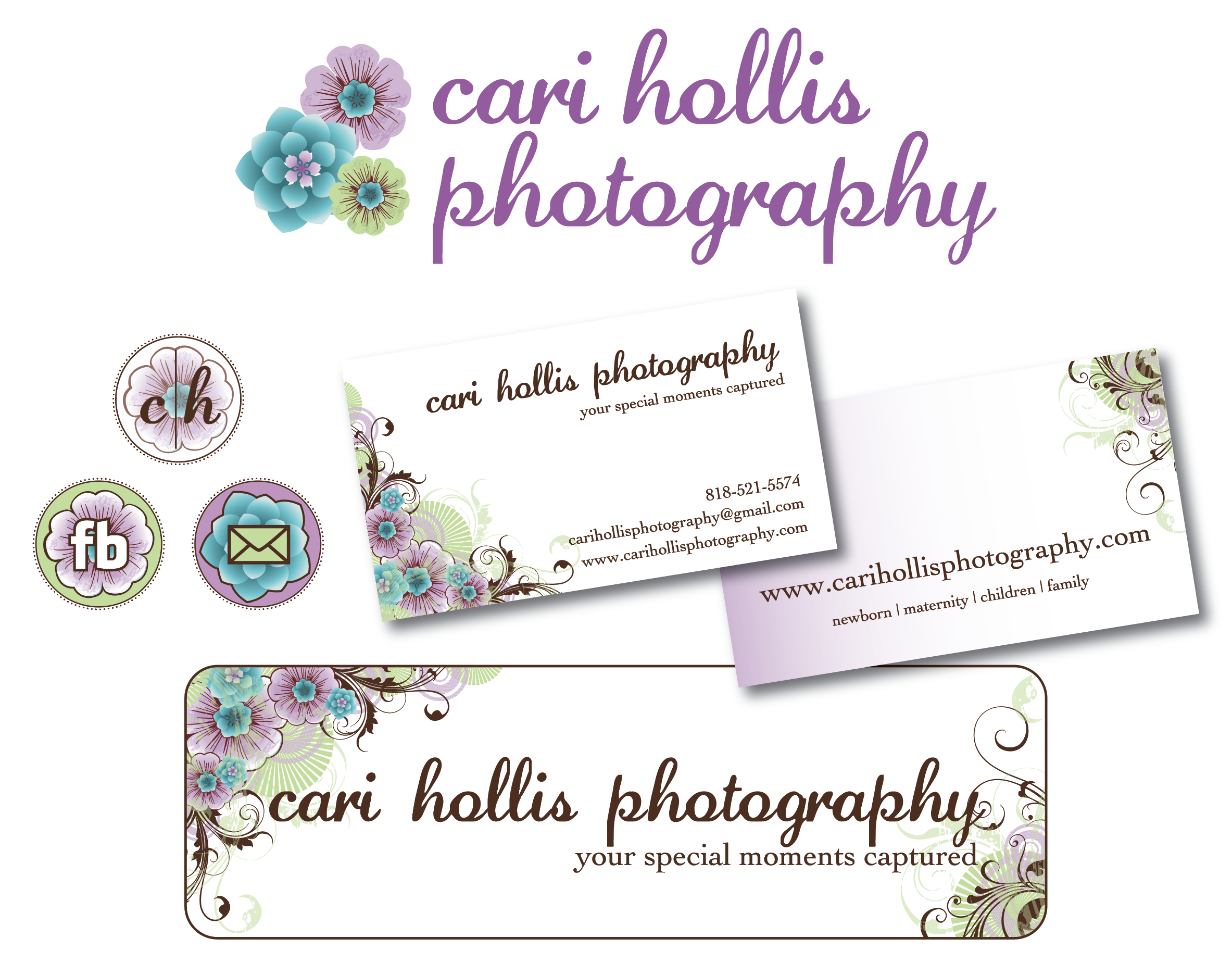
The flower motif and colors were inspired by the custom camera strap she found on Etsy. We designed a bunch of logo variations, business cards, website buttons, and more. We even did gift certificates and advertising graphics for social media.
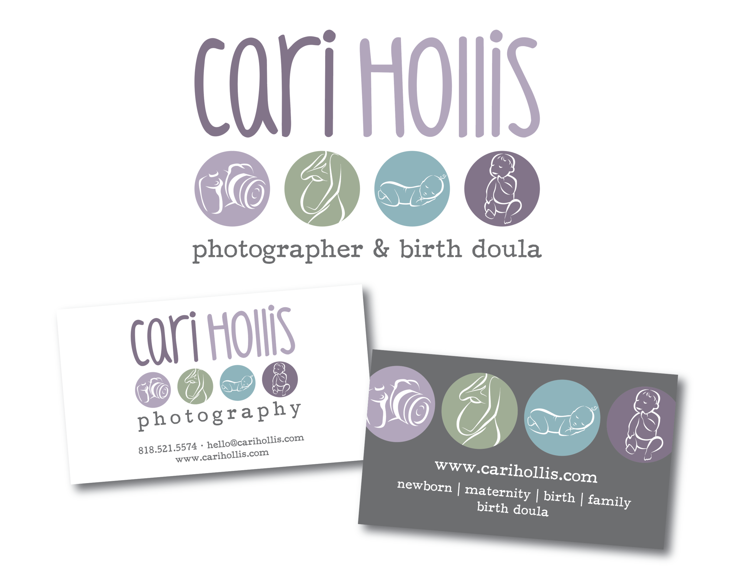
A few years later, Cari was ready to rebrand and she had NO idea what she wanted for her new logo. She had also added the role of a birth doula and birth photographer to her repertoire. We tried a lot of different concepts, color schemes, fonts, and graphics and, after a lot of back and forth, we finalized this design. This is still one of my favorite logos that I created for her.
After many years as an amazing photographer, she decided to hang up her camera and delve into a couple of different direct sales companies and social media consulting, and since they usually require you to use their pre-designed graphics, we went a different direction and branded Cari all on her own.
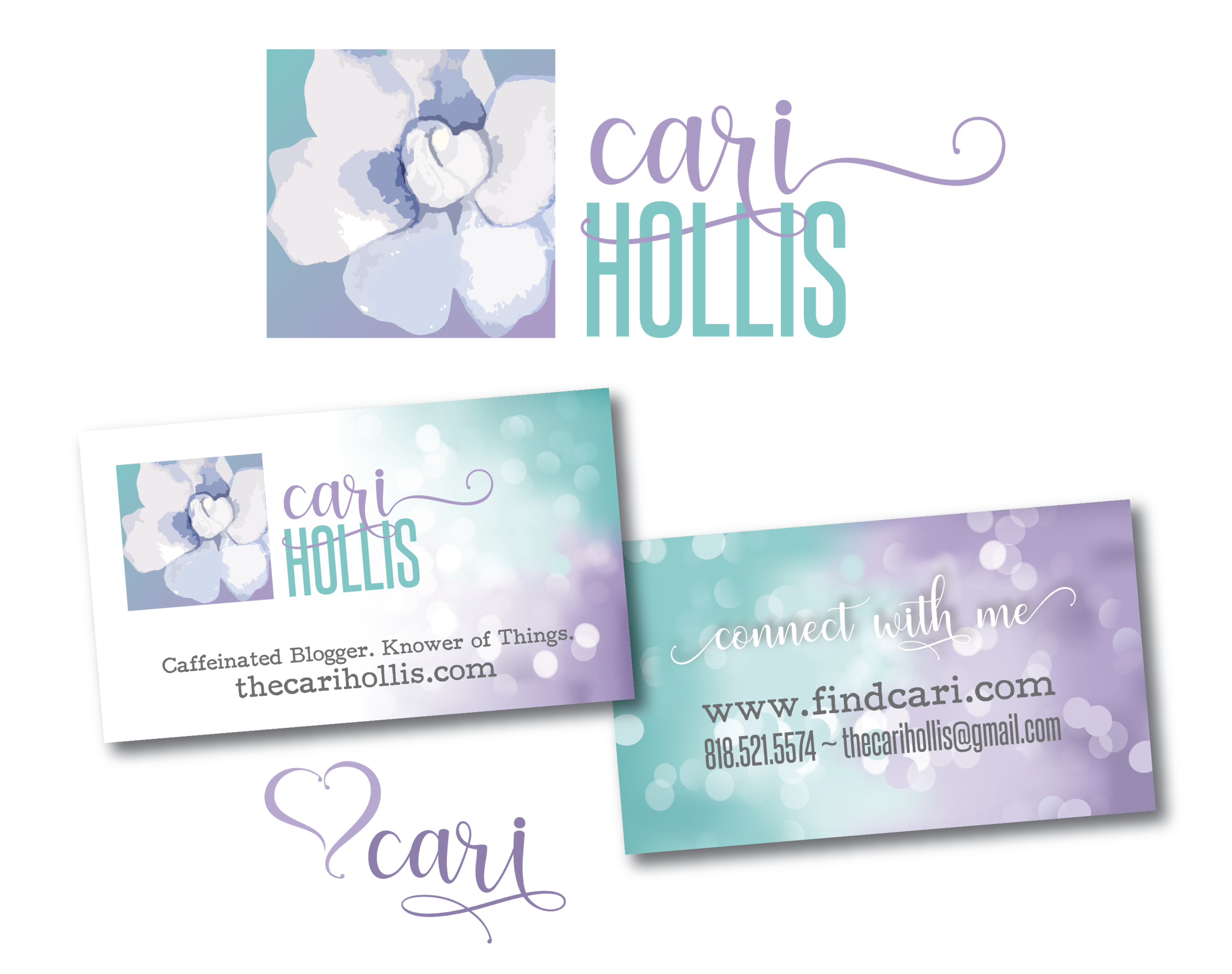
This way, her brand remained the same no matter what kind of business she was working on. The bokeh backgrounds paid homage to her background as a photographer.
Earlier this year we rebranded again. Cari wanted to keep the gardenia as a graphic element and we kept the typewriter font because it’s a favorite of hers. We went with the same color scheme for the most and will keep the bokeh backgrounds, but added new fonts and a watercolor motif too.
She hasn’t been able to update her website with her newer branding yet because she’s busy running Direct Creatives!
You can watch the TikTok video I made documenting how I created her new logo here.
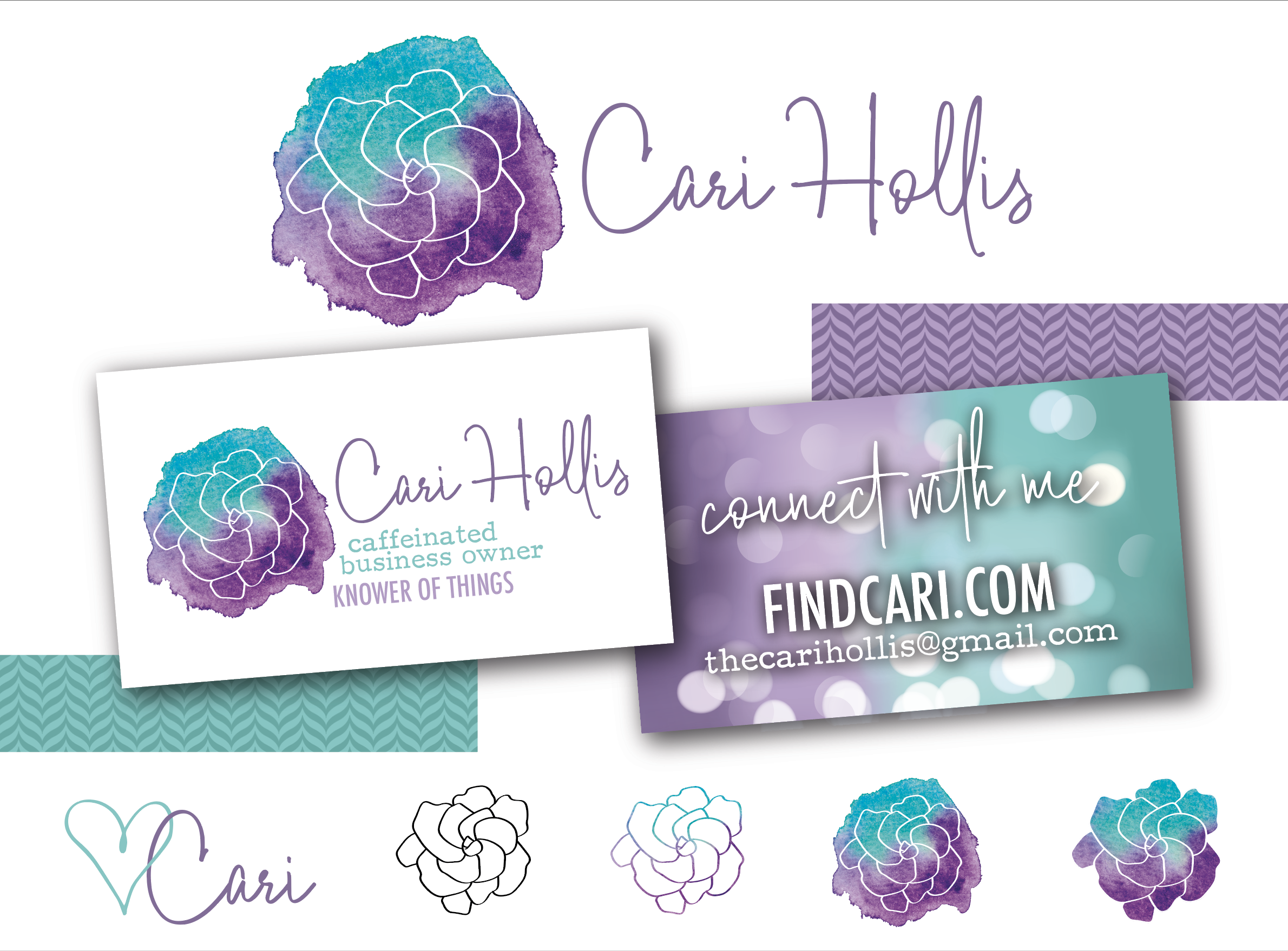
I love how Cari maintains the same general color palette with the purple and aqua.
I’m curious where her branding will head next!