illustration

Twin Castle Cellars Wine Label

I created this wine label for a very small vintner in the Livermore Valley in California. She wanted to use an illustration of a pair of castles that are close to where she grew up in the label. She grew up near Manderschied, Germany and used to play in these castles when she was a little girl.

Here's what I came up with: 

I created the image using watercolor along with pen and ink. Then I scanned the illustration and added the text in Photoshop. 

I really love how it turned out, and when it's printed on a textured, adhesive paper, it looks like an original watercolor. 
Sanford Cellars Wine Labels

My Uncle Mark makes wine as a hobby. But not as a let's-make-a-bottle-of-wine-and-see kind of hobby, more like let's-buy-one-ton-of-grapes-and-make-twenty-gallons-of-zinfandel kind of hobby. He's entered his wine into state and county fairs and likes to give it as holiday gifts too. And as a family member, I'm always happy to help with crushing or bottling when I'm in town if the timing is right. It's fascinating to learn about the process, even down to the chemistry. 

And his Zindandel and Viognier are my favorites.

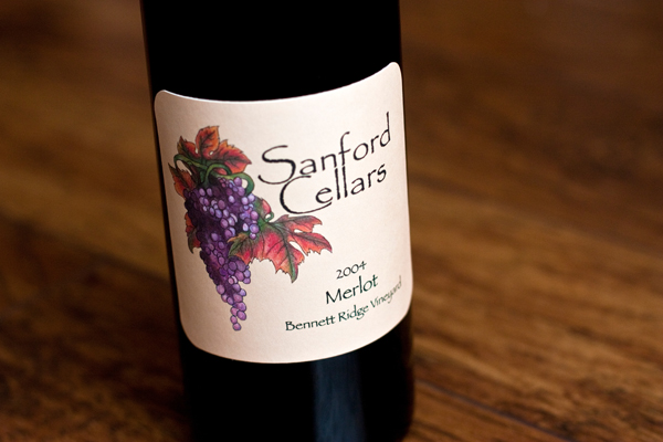
This was the first label I created when he first got started. I did the grapes and leaves in watercolor and then added the text in Photoshop.

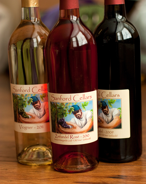
I created this label a couple of years later using a photo that a friend took of my uncle while he was harvesting grapes.

There's actually a second version of this label where the grapes are green and his hat is red, thanks to the magic of Adobe Photoshop. That label is used when he's bottling white wine.

I think it's time for a new one... any ideas?

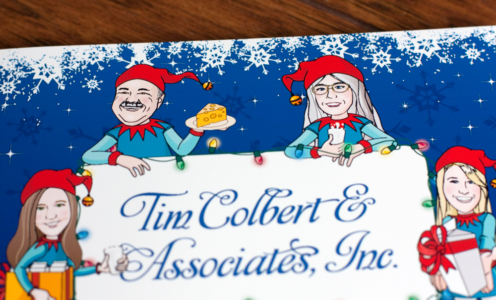
Tim Colbert & Associates Holiday Card - 2011 & 2012

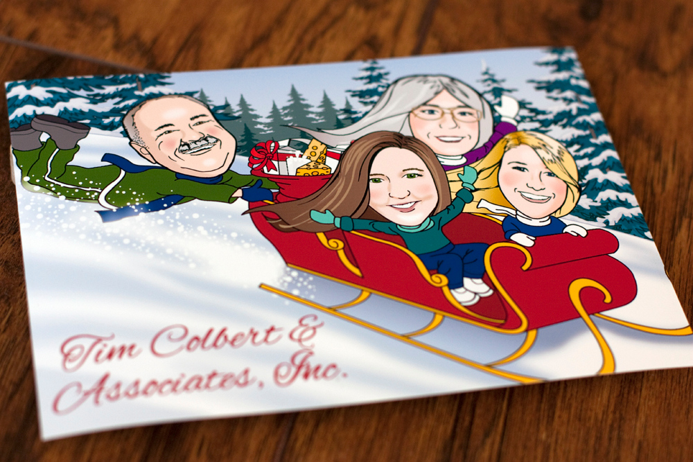
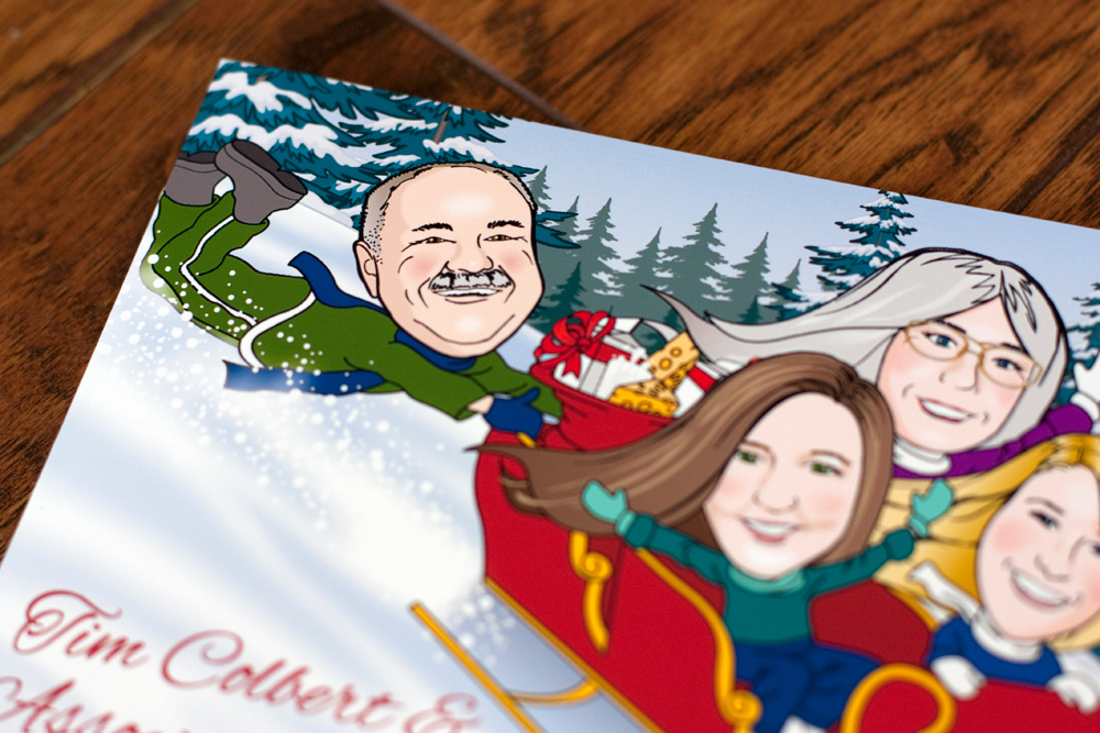
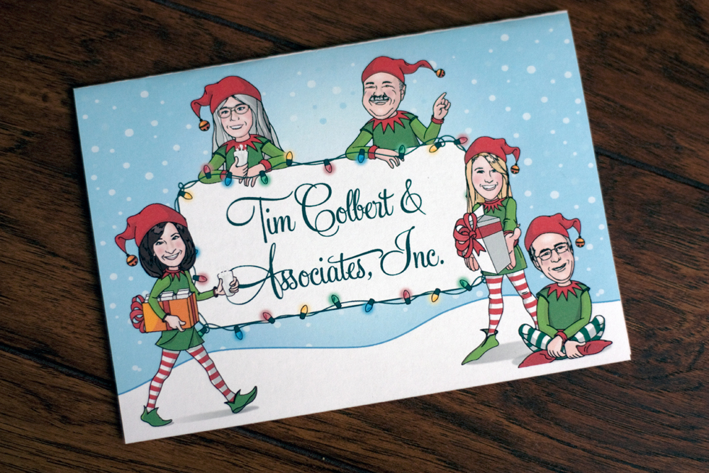
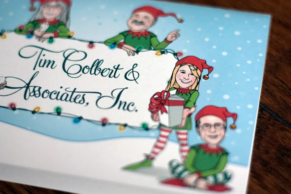
I had a blast working on this fun holiday card for a firm in northern California. They work with clients in the dairy industry, hence the milk references. 

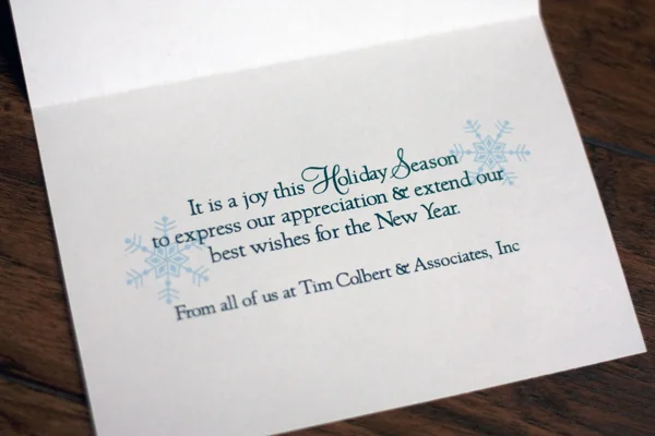
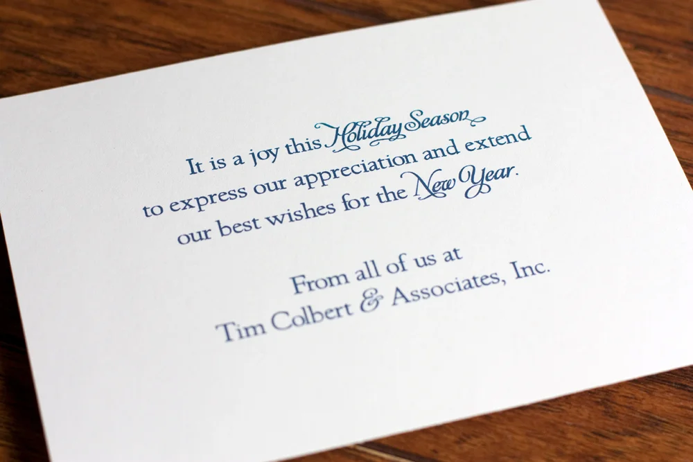
This simple message was on the inside of the folded card:

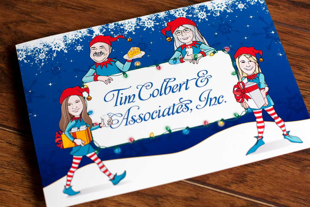
The following year we changed up the colors and fonts a little bit, but kept the same overall look.

Our Holiday Card - 2011

When my family first moved from southern California to Utah, our son had just turned two and we were excited and a little apprehensive about moving to a place with a real winter... you know, the kind where it snows and the temperature might go below 50°! 

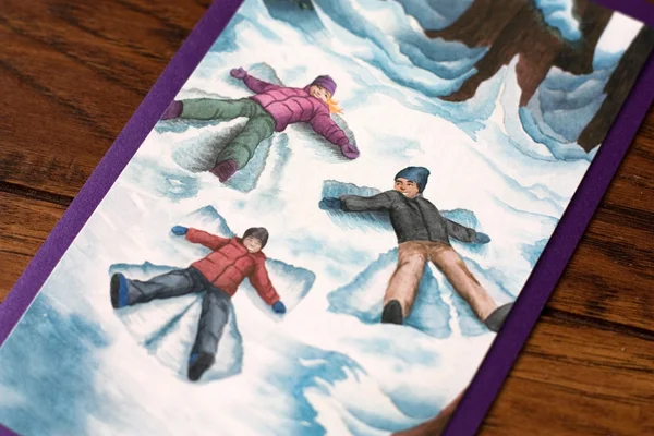
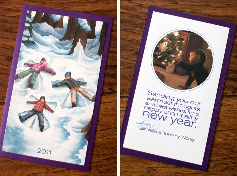
I wanted our holiday card that year to reflect our new home and I thought of the card I sent in 2008. We didn't have an opportunity to take any family photos, so I created a watercolor painting of the three of us and printed them on watercolor paper on my trusty HP printer.

Notice I have no holiday cards for 2009 and 2010. I was a brand new mom on maternity leave in the winter of 2009. It took me almost six months to even main his birth announcements! And 2010? It wasn’t happening.

For the back, I just happened to take a lovely photo of our son admiring an ornament on my grandmother's Christmas tree a few weeks before Christmas. It worked!

I totally scrounged together whatever pieces of scrap card stock I had to print these too. Some had purple card stock, some had navy blue, some had a lighter blue. And I just changed the color of the text on the back to fit with the card stock. I even used leftover envelopes I had from a previous project. 

It was created last minute and in a bit of a rush, but it's still one of my favorite holiday cards that we've mailed.

Our Holiday Card - 2008

In 2008, my husband and I were newly married and happily living life in southern California. It was the first year we were sending out a holiday card as a married couple and I wanted to do something fun. This watercolor painting was the result. 

Yup, snow angels in the sand. 

I printed them onto card stock and mounted them onto pre-made red and white note cards that came with red envelopes from Target. I added a short, hand-written message on the inside too. Simple and fun.