client work

Jake's 1st Birthday

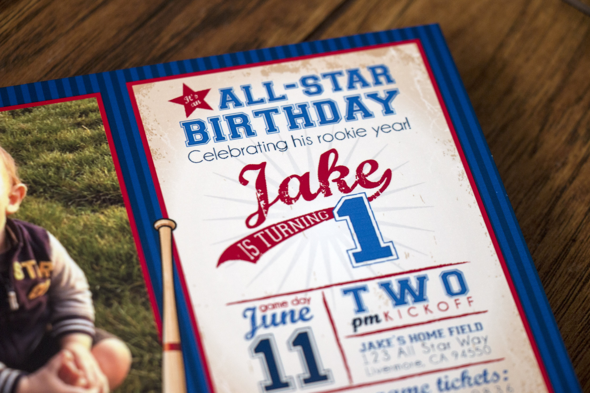
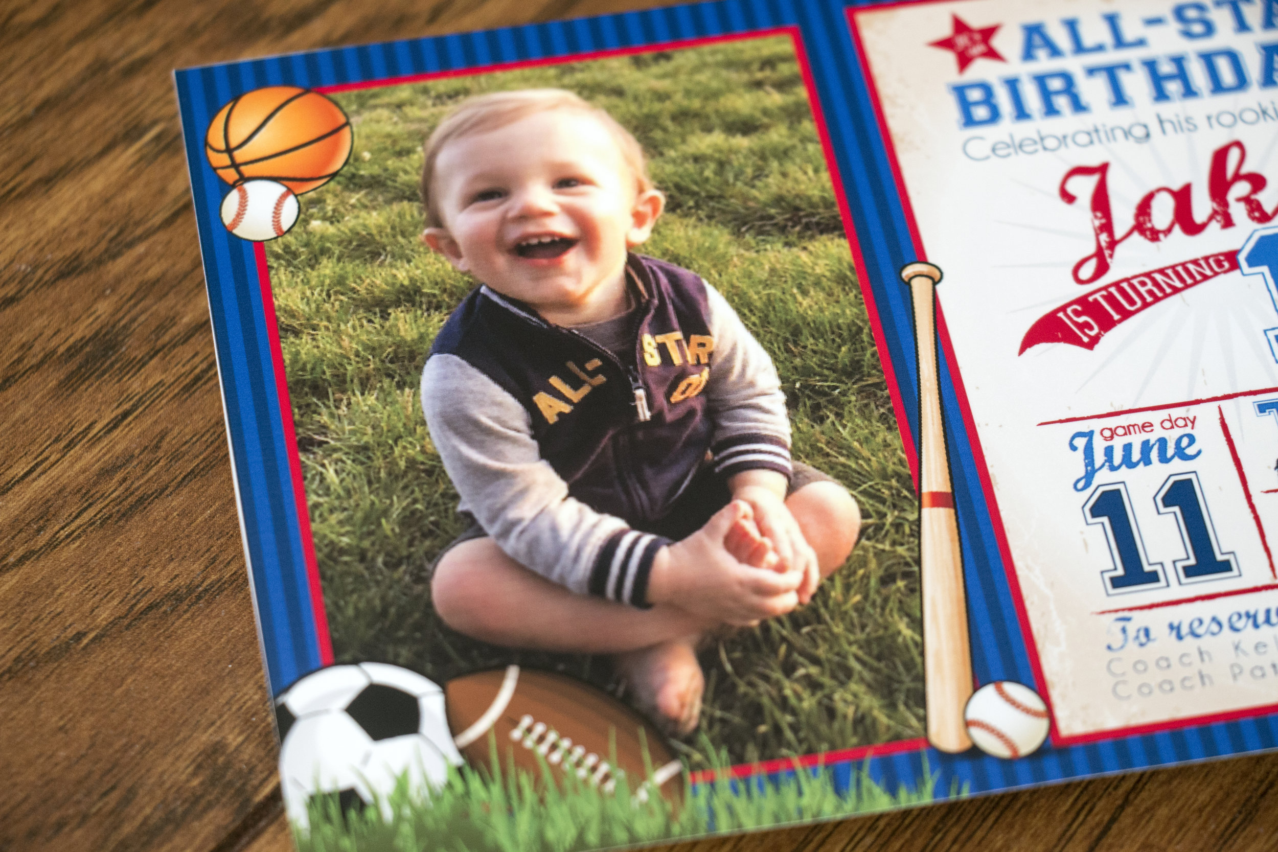
I was honored to get to design wedding invitations for Kelly and Patrick a few years ago, so it was a real treat to get to design birthday invitations for their youngest son for his first birthday. They wanted to go with a sports theme that had a little bit of a vintage feel. Kelly was finding lots of invitations she loved, but most of them only showed one sport rather than a variety and many weren't done in a style she loved. 

Here's the invitation:

I love that huge smile!!

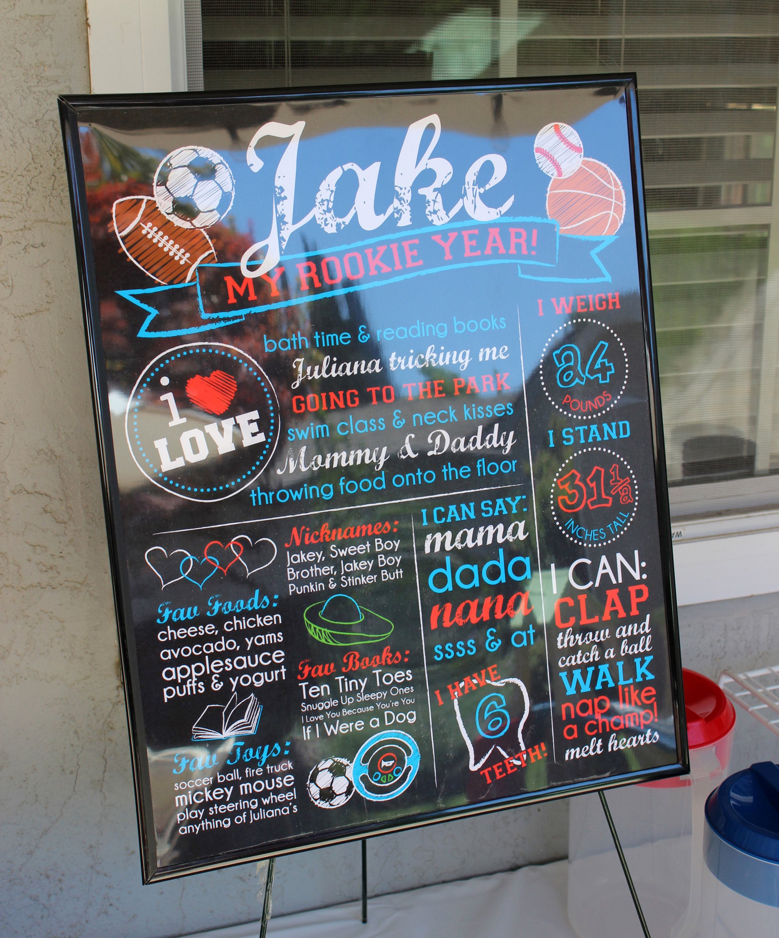
For the party, we made a faux chalkboard that contained all of his favorite things, books, foods, toys along with his one-year stats. I love doing these!

A rookie card long with a few toys and yummies filled goodie bags and they were tied with these favor tags. 

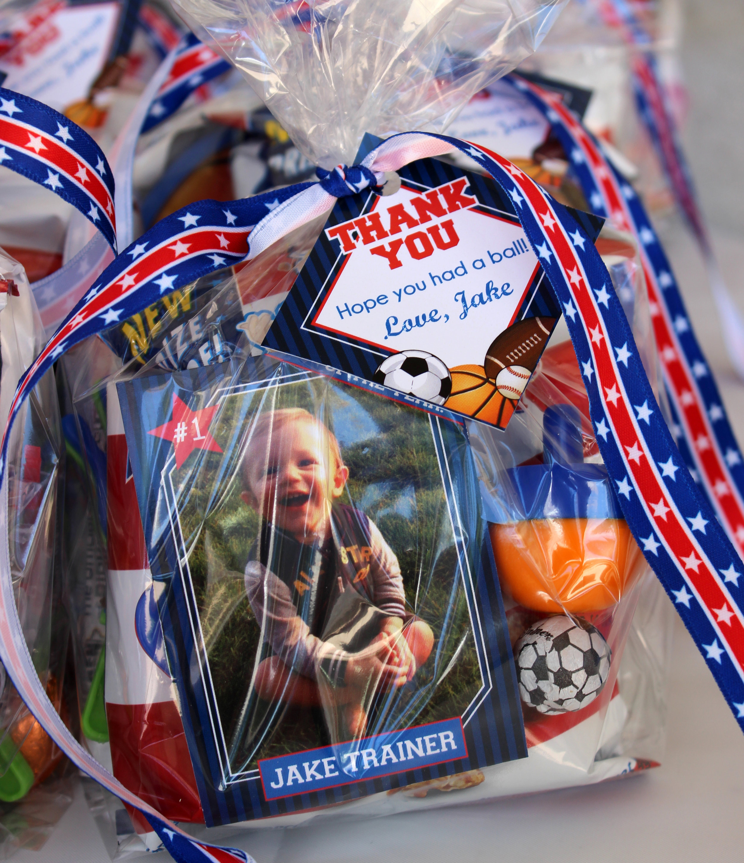
Here's a closer look at Jake's rookie card:

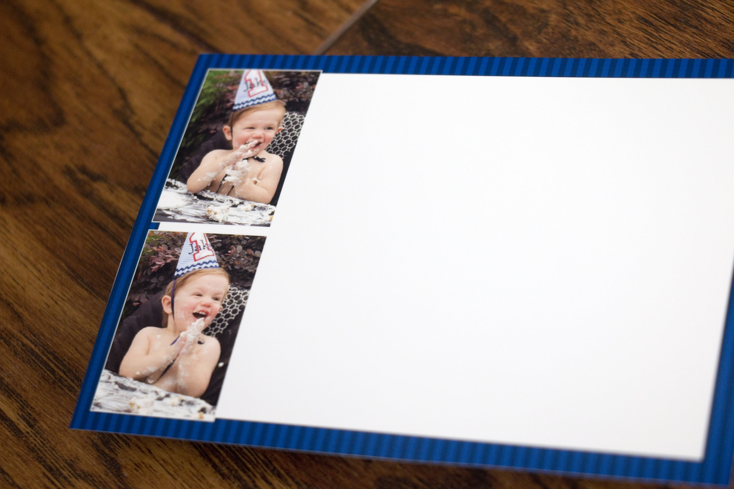
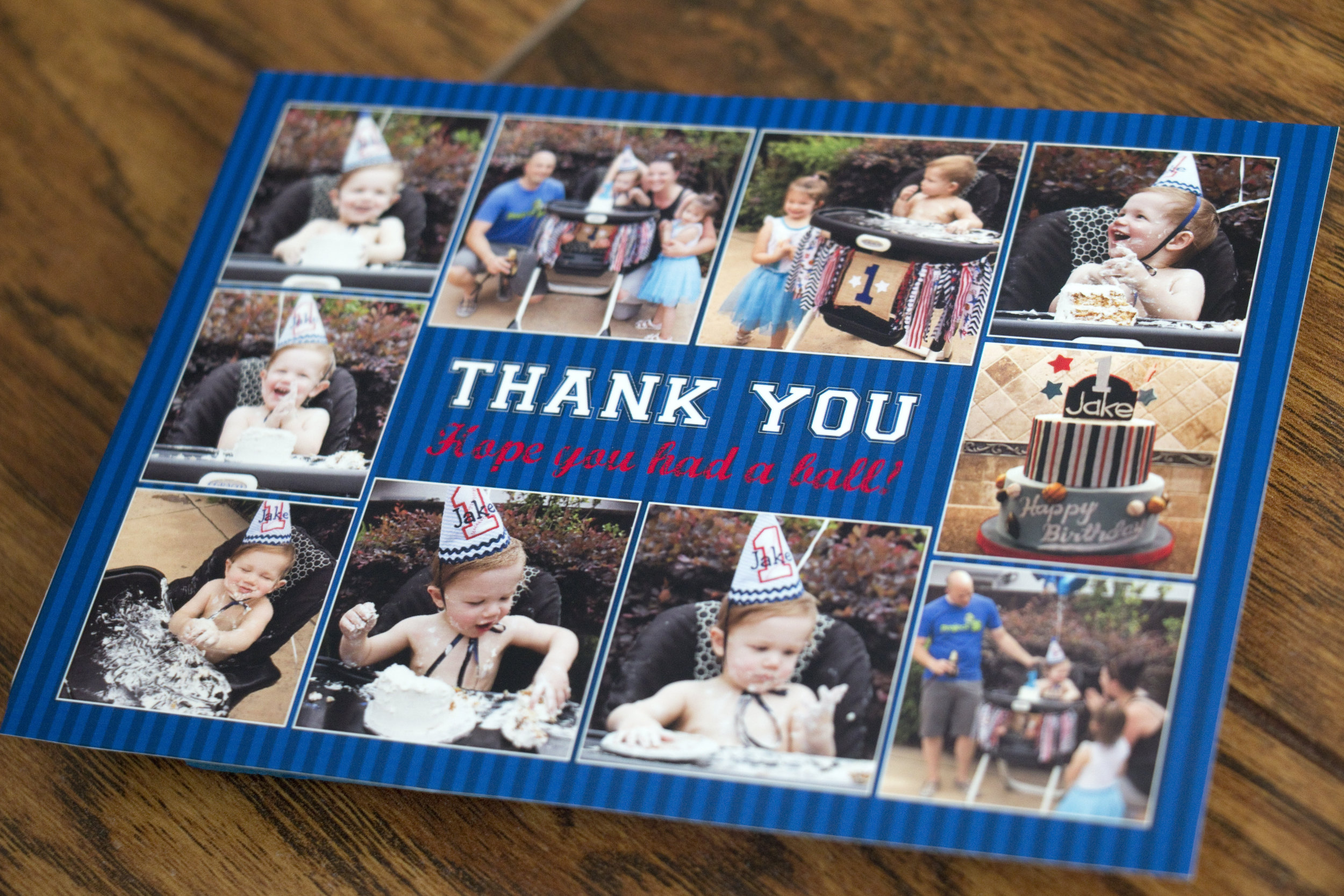
Lastly, with a bunch of the photos taken at Jake's birthday party, we created a two-sided thank you card that included a space for Kelly and Patrick to write their message. 

Wishing you a very happy birthday Jake!!

Jaxon's 1st Birthday

Jaxon's mommy JoAnna has been a long-time client of mine from many years ago when I designed her wedding invitations. I had the privilege of designing invitations for her baby shower and again a birth announcement for her firstborn. Now that baby is turning one and it's time for his birthday party! JoAnna went with a festive circus theme and I had a blast playing with the text. 

We had a little fun with the wording too!

 I created a simple favor tag that JoAnna adhered to popcorn boxes for guests. She was gracious enough to send me a couple of photos from Jaxon's birthday party.

After the party, we created a thank you card that included a couple of photos from his cake smash too. I love how it turned out!

The back included plenty of space for JoAnna to write in a thank you message.

I love the primary color scheme for this party and how everything came together. It looks like the party was a blast, happy birthday Jaxon, and happy momiversary JoAnna!

Melissa & Patrick's Baby Shower

As if there weren't enough bicycles throughout the decor and printed items at Melissa and Patrick's wedding, we took it a step further with their baby shower, and even added a bike trailer.

We took the same two bicycles that I used on their wedding invitations and I added silhouettes of the two of them riding the bikes and a baby trailer. The result was a super fun design theme for their baby shower and gender reveal.

These were printed at their local Office Depot and they purchased Papaya envelopes from Paper Source.

For this baby shower, we had signs ALL over! First was a sign on the front door of the venue:

They had Burt's Bees lip balm as a party favor, so it made it fun to add the "what will it bee" schtick throughout, but without doing a full-on bumblebee theme.

Guests were encouraged to mark their guesses on the board for the gender of the baby. I guessed girl, but was really second-guessing myself. Even on a chalkboard that was printed on paper, it served well as a real chalkboard.

Guests were also encouraged to fill out a card leaving their wishes for baby. I LOVE these for a wonderful keepsake for both the parents and the baby.

Rather than have a guestbook, we did this thumbprint tree instead. This is the same tree I created for Patrick and Melissa's wedding, including the two bicycles leaning against the tree trunk. I flipped it around and added a tricycle and the Dr Seuss quote. It's one of my all-time favorite quotes:

Today you are you, and that's truer than true.
There is no one alive who is youer than you.

This was such a FUN sign to make. We looked up as many gender-predicting folk tales that we could find and asked Melissa to do all of them. I love the mix of results. 

Melissa and Patrick created a series of games and deemed them the Baby Shower Olympics. Events included guessing a baby item by feel only, Blindfolded Diaper Changing, Pin the Sperm on the Egg, Bottle Chugging, and a test on the pregnancy duration for multiple animals. 

Participants kept track of their own points with the scoresheets we created and the top three winners won a gold, silver, or bronze "medal" that Patrick made by glueing a bottle nipple to a medal and spraying it with metallic paint. 

The mimosa bar just made the day that much more fun. By the way, POG mixed with champagne is a stellar combination (POG = passion fruit, orange and guava juice)!

This was such a fun and entertaining baby shower, and I really love how Patrick and Melissa made a huge effort to make it a fun event for both men and women among their friends and family. Just like their wedding, their baby shower was truly a reflection of their personalities. Congratulations!!

M's Birth Announcement

I've been lucky to be able to design a lot of fun items for this family, one of my favorite families. From their wedding to the birth announcement and birthday invitations of their oldest baby and now the announcement for their daughter!! 

All of the names have been changed to protect privacy.

For the back, I made a photo collage similar to one I saw on Minted.com a while back. I loved the diagonal lines for everything. It made for a much more dynamic collage.

A heartfelt congratulations to this beautiful family!!

Jackie & Michael

My little sister got hitched back in October and it was only natural that I would design the printed items for her beautiful, southern California wedding. She wanted her main colors to be navy blue and ivory with lots of lace. Accent colors were a Fall palette in orange, red and gold. Her wedding gown and the bridesmaid gowns had lots of lace too.

First, for a save-the-date, we paid homage to how Michael proposed to Jackie. 

He convinced her they were participating in a road trip scavenger hunt that took them all over southern California and then up the coast to northern California. They ended the hunt and spent the weekend with our parents where he got down on one knee and popped the question in front of our family... and admitted that the scavenger hunt was a ruse and an excuse to drive up to the Bay Area.

Every red dot represents a stop on the scavenger hunt.

On the back I turned the silhouette of the state into a photo collage from when Michael proposed.

When it was time to design invitations, Jackie wanted to use lace along with their colors. She loved the invitations I created for Erin & John and wanted a similar vibe. 

We went with gate fold cards in Cobalt from Cards and Pockets and they were held closed by a circle that we designed using the same lace motif.

Michael requested that I include a graphic of a samurai sword to represent the honor code he follows with martial arts. He and his groomsmen all carried swords in the wedding ceremony too, it was pretty rad.

For the big day itself, we created a lot of fun items! First, each of the guest tables was named after a submission move in jujitsu. Jackie and Michael posed in each move and took photos of them all, with Jackie in the winning position. 

The rest of the photos from this post were taken by the very talented Katie Jackson

Then, we printed escort cards for each guest directing them where to sit. The folded cards were color coded to indicate to the catering staff what menu item they were having for dinner.

Jackie (a Lifetime Girl Scout) wanted the favors to be Girl Scout Cookies and Michael was more than happy to agree. They each chose their favorite cookie (Thin Mints and Samoas) and placed a couple in individual boxes, each with their own unique label. 

"Love Samoa" and "Mint to Be," get it?! 

This was the sign that adorned their sweetheart table.

We created a bunch of signs that were placed throughout the reception venue:

Side note: Jackie and Michael had no idea what they wanted to use for a guestbook. They weren't thrilled about a book that just listed everyone's names, and they don't have space in their home to hang a big print on the wall with everyone's names. I told her I'd take care of it (two weeks before the wedding!). I took all of the engagement photos taken by Katie Jackson and made them into a photobook that had lots of white space on the pages, like a yearbook. That way people could leave their well wishes wherever they wanted. With a coupon through Shutterfly the book was less about $35. This is by far, my favorite way to do a guestbook. I did it for my wedding and I still sometimes thumb through our book almost 10 years later.

Back to photos!

A table set aside in memory of the family and close friends who couldn't be there. This is what the sign says:

In Loving Memory
Those we love don't go away,
They walk beside us every day.
Unseen, unheard, but always near,
Still loved, still missed,
And very dear.

"Life is Short, Eat Dessert First" Jackie doesn't care for cake, so they had wedding pie!! The light-up letters were a last-minute thing too, I love how they turned out!

It was truly an honor to get to design all of these for my little sister and I'm so thrilled with how it all turned out. It was an honor to stand beside you as you said "I do," congratulations!!

A last little gem from Katie Jackson, she really captured our relationship here. Hahaha!

Emily's Sip n See

When my dear friend Cari was expecting her second baby, she wasn't thrilled with the concept have having a baby shower since it was her second baby. Instead she opted to have a sip n see. 

Never heard of a sip n see? I hadn't either until recently. It's basically an open house that Mom and Dad host where friends and family come to meet the new baby and wish Mom and Dad well. They come by to enjoy a snack or a "sip" of something bubbly, and then go on their way, keeping the visit short. Gifts are not expected and there's rarely a registry involved. It's a tradition that I have been told is more common in the eastern United States and growing in popularity, especially when a family is welcoming their second or third (or more) baby.

Cari and her husband hosted their sip n see when their daughter was about one month old and we created a simple invitation for the occasion. I had some fun with my watercolors getting the right shades of purple to Cari's liking.

Their address has been changed to protect privacy.

Welcome to the world Emily!!! 

Raquel & Mark

I had the privilege of working with Raquel on the invitations for her wedding a few months back. She and Mark were planning a destination wedding at the Hard Rock Resort in Cancun, Mexico.

First we did a fun safe-the-date. She wanted to incorporate a little bit of a concert poster vibe and also let her guests know they if they were planning to come, they needed to book their trip as soon as possible. 

Can you see their adoring fans, subtly in the background of their sunset. The reservation information has been changed to protect privacy.

When it was time to create their wedding invitations, they wanted to incorporate ocean life in watercolor and have it look very elegant. I really love how they turned out!

The upgraded their printing and had the gold text printed with metallic gold foil. I LOVE how it turned out!!

We did a simple RSVP card that directed guests to share their responses on the couple's wedding website. I changed their website URL to protect privacy.

Lastly, I created a simple coral graphic that they had printed in gold foil on the back of their gold envelopes. This was such a subtle detail that I really love. And yes, I changed their address in Photoshop. 

I am so in love with how this invitation turned out, it almost makes me want to plan another wedding. Almost. 

Congratulations Mark and Raquel, I hope your Cancun wedding was amazing!!

Kari & Nathan

My cousin, Kari and her fiancé, Nathan were planning a destination wedding in Kauai and they loved the invitations I created for Joanna and Matt. So we stuck with the same basic design and added elements to make it their own. 

Everything was printed on linen card stock by Cards and Pockets. We also created wraparound address labels and the envelopes were from Paper Source. 

Friends and family members who had already committed to attending were the only ones who received an invitation. The inserts included a map to the ceremony and reception. (This was the very first time I saw less-than-stellar print quality come from Cards & Pockets. The blocks of color didn't print as vibrant as they should have.)

There was also an invitation to attend a luau with the bride and groom and their family in lieu of a traditional rehearsal dinner.

The back showed a map on how to get there.

This was one destination wedding I was thrilled to get to attend!

The long tables were decorated with orchids and ripe pineapples that smelled amazing. At each place setting was a menu that I designed with their graphics and an engraved luggage tag that served as both a place card and a wedding favor. Each guest's initials were engraved on the back of the luggage tag.

It was an absolutely GORGEOUS wedding and such an honor to get to contribute a little, take some photos, and share the special day with Kari and Nathan. 

Congratulations!!