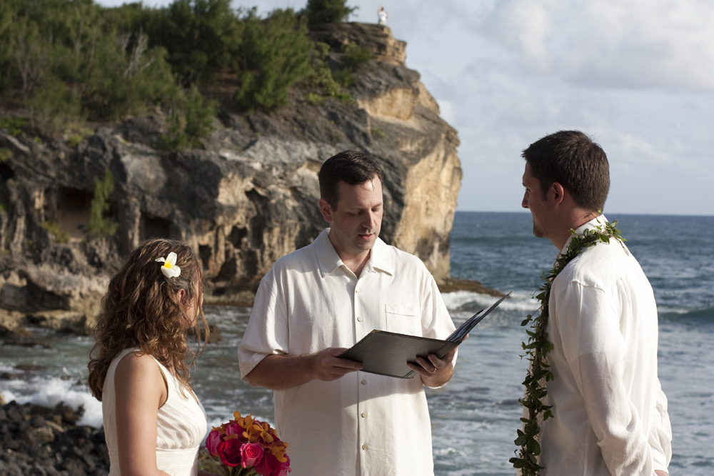
I had the privilege of creating artwork for the Family Forest Fest; a camping experience designed for families with young children. In 2017 they had events in two locations; one on Whidbey Island outside of Seattle, the other at Leaping Lamb Farm in Alsea, Oregon. In 2018, they had one event in Alsea, Oregon. They hosted a teddy bear hunt, outdoor play for kids, live music, bubble professionals, a movie night, a costume carnival, night hikes, family yoga, and so much more. There were also outdoor gear vendors there with gear for campers (and kids) try out. It looked amazing and I was sad to see them stop the events when it was becoming too difficult to make it sustainable.
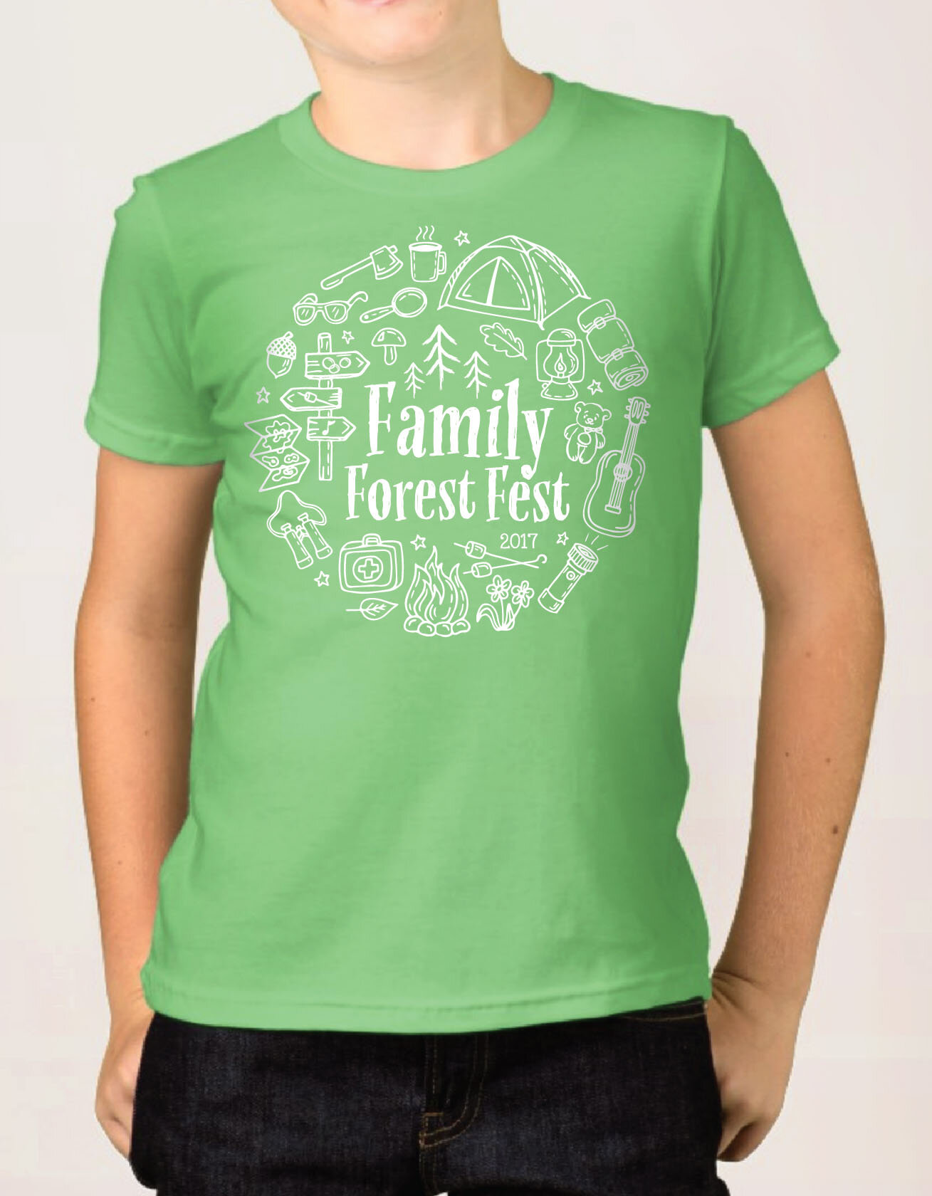
I designed t-shirts for the events along with magazine ads, social media graphics, event maps, signs, and banners. Here's the adult t-shirt from 2017. It was printed in kelly green for staff members and navy blue for adult attendees.

The kids tees were printed on lime green.

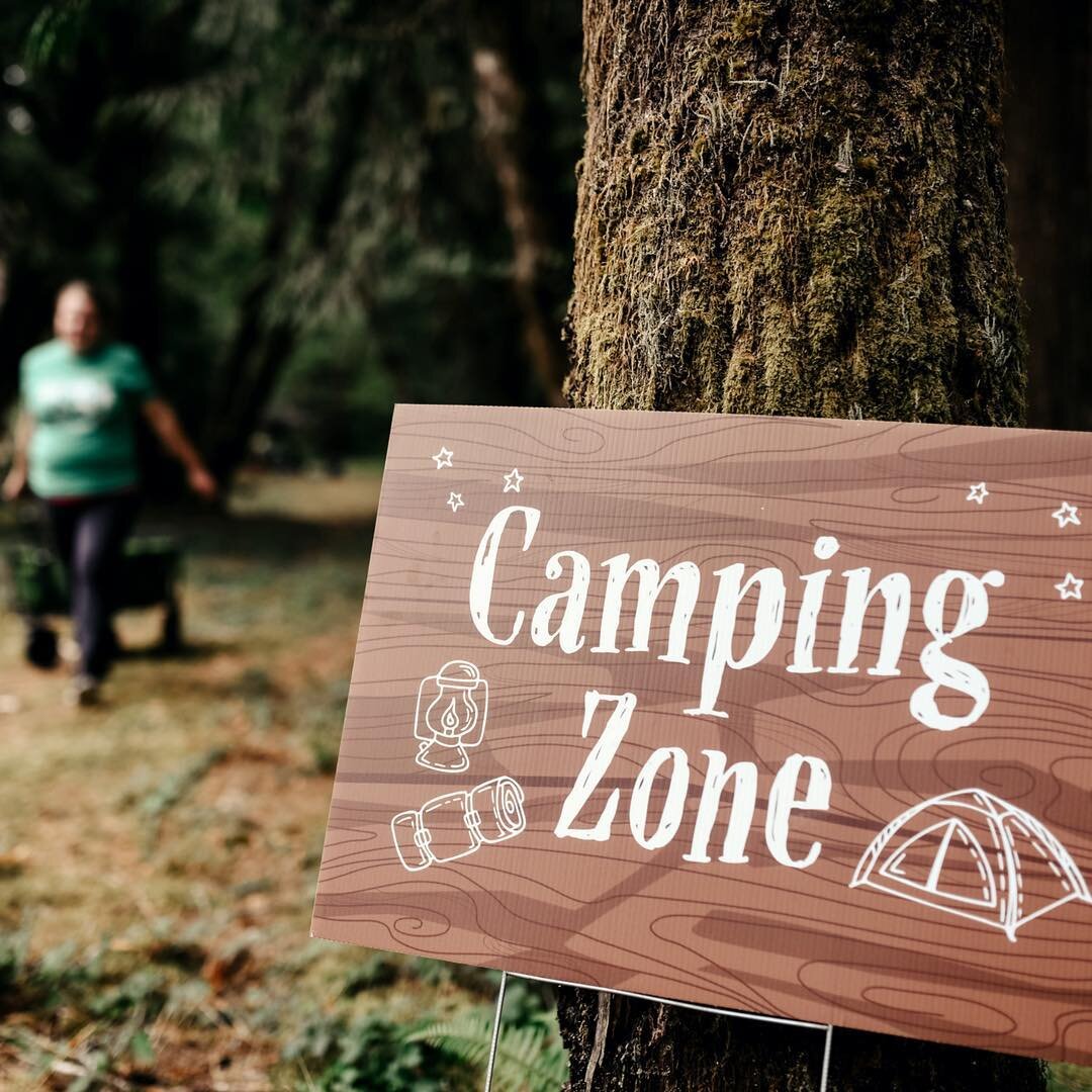
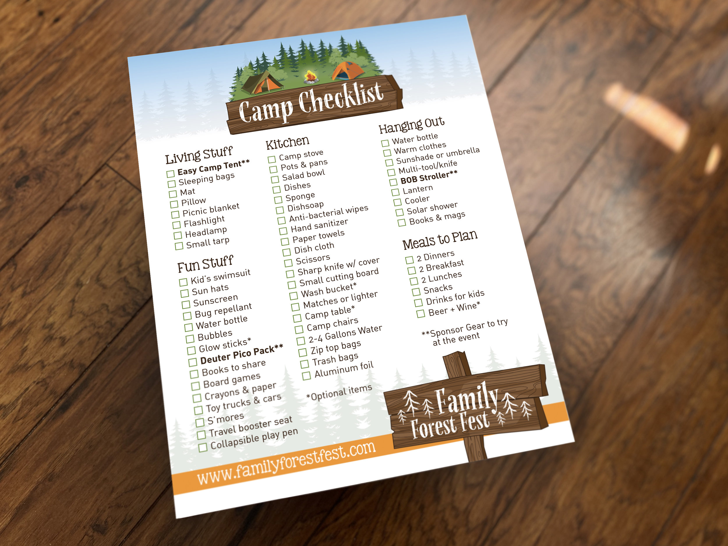
I also created signs to identify different parts of the camp and a map of each location so campers knew where everything was. Some spaces were even sponsored.

Event map for the Oregon event:

For the 2018 event, they were able to use many of the same signs, but we did revamp the t-shirt designs:
Kid’s shirts were bright blue:

For the adult tees, they went with this lovely shade of dark green along with some lighter green and gray options:


Image by Heartbeat Photography
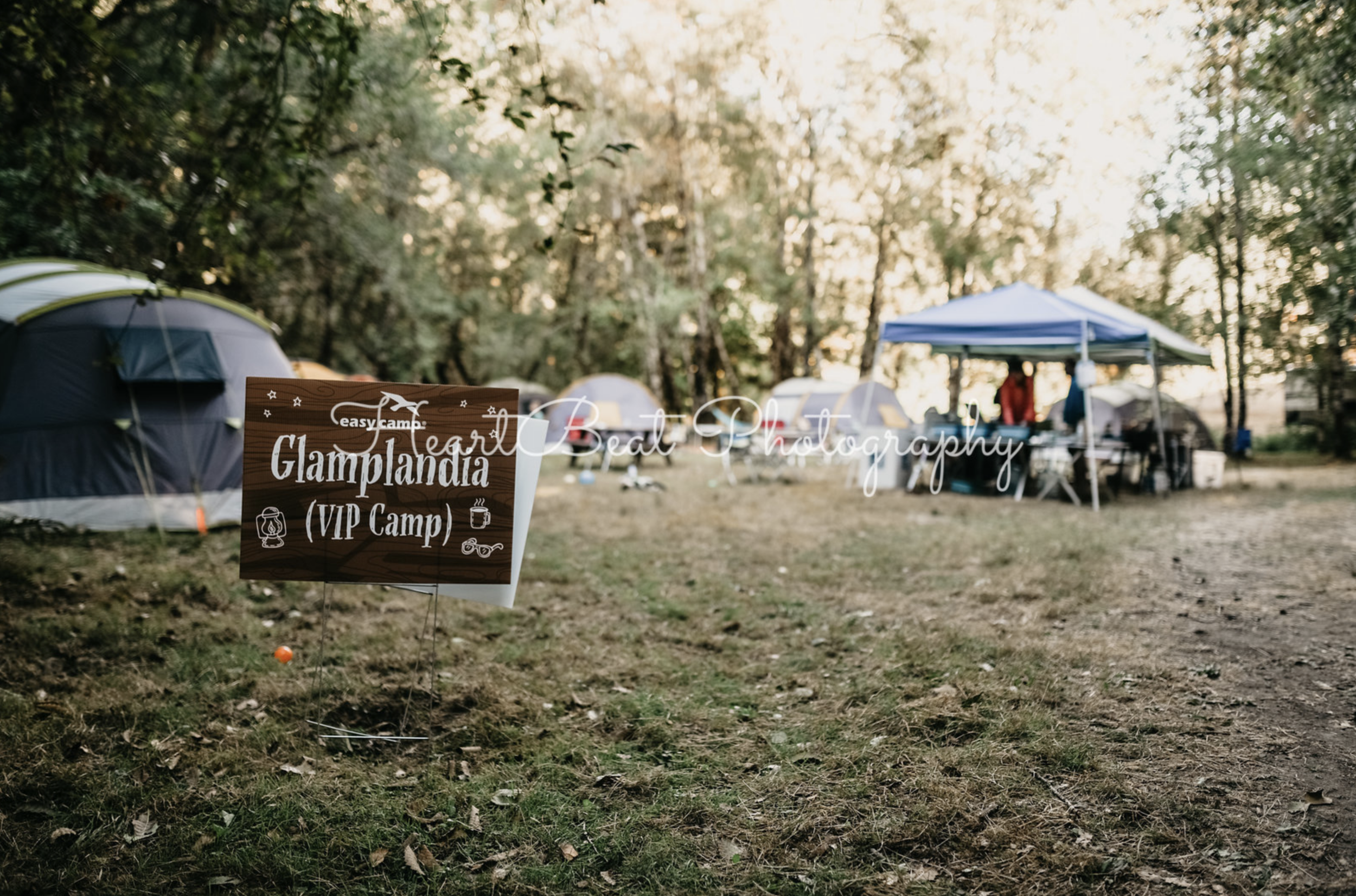
Image by Heartbeat Photography

Image by Heartbeat Photography

Image by Heartbeat Photography
It was such a pleasure to work on all of these items for Family Forest Fest. Thank you so much Shanti and Erin!