escort cards

Jackie & Michael

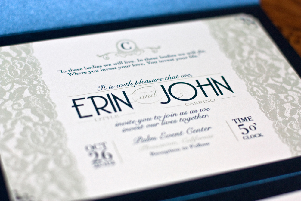
My little sister got hitched back in October and it was only natural that I would design the printed items for her beautiful, southern California wedding. She wanted her main colors to be navy blue and ivory with lots of lace. Accent colors were a Fall palette in orange, red and gold. Her wedding gown and the bridesmaid gowns had lots of lace too.

First, for a save-the-date, we paid homage to how Michael proposed to Jackie. 

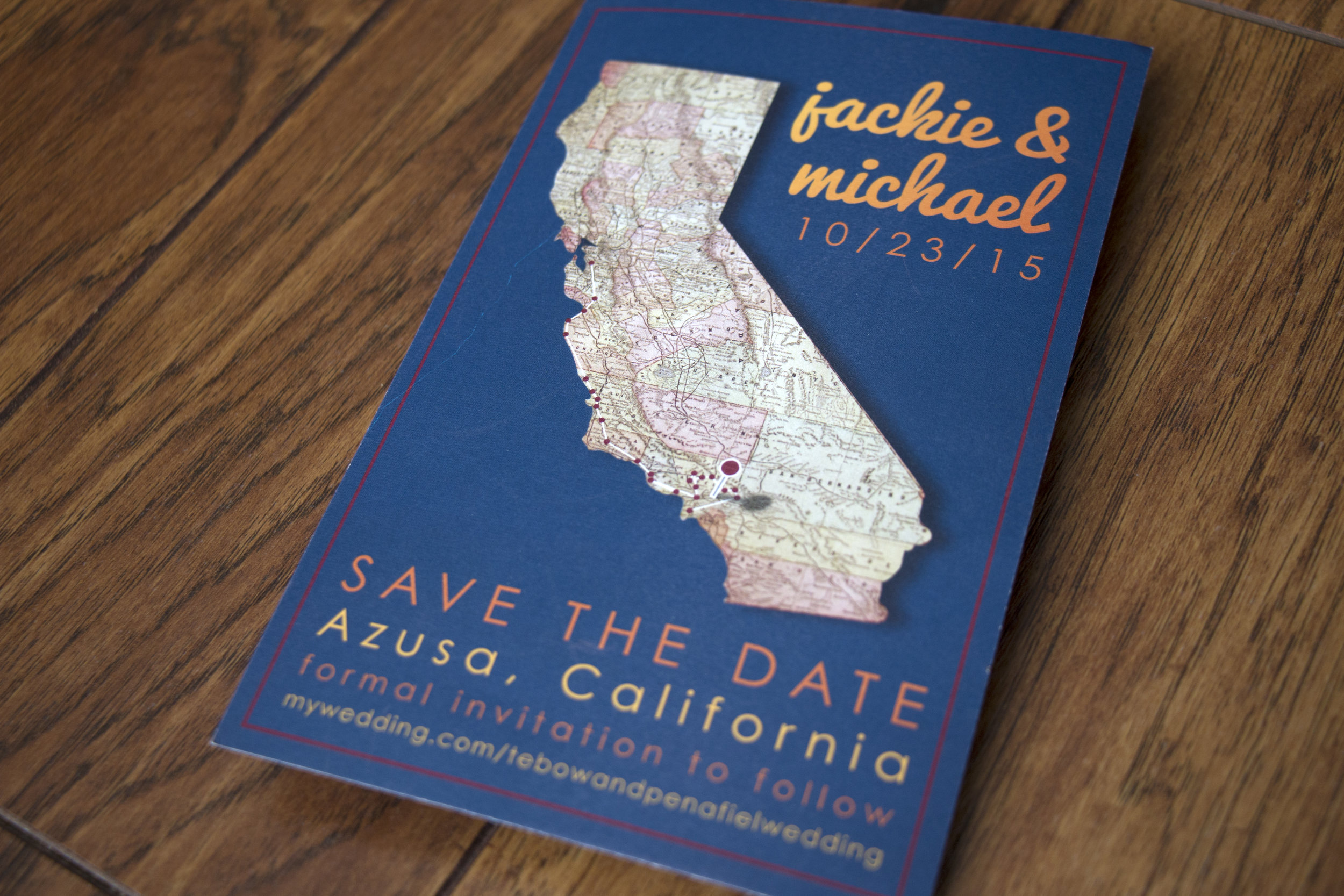
He convinced her they were participating in a road trip scavenger hunt that took them all over southern California and then up the coast to northern California. They ended the hunt and spent the weekend with our parents where he got down on one knee and popped the question in front of our family... and admitted that the scavenger hunt was a ruse and an excuse to drive up to the Bay Area.

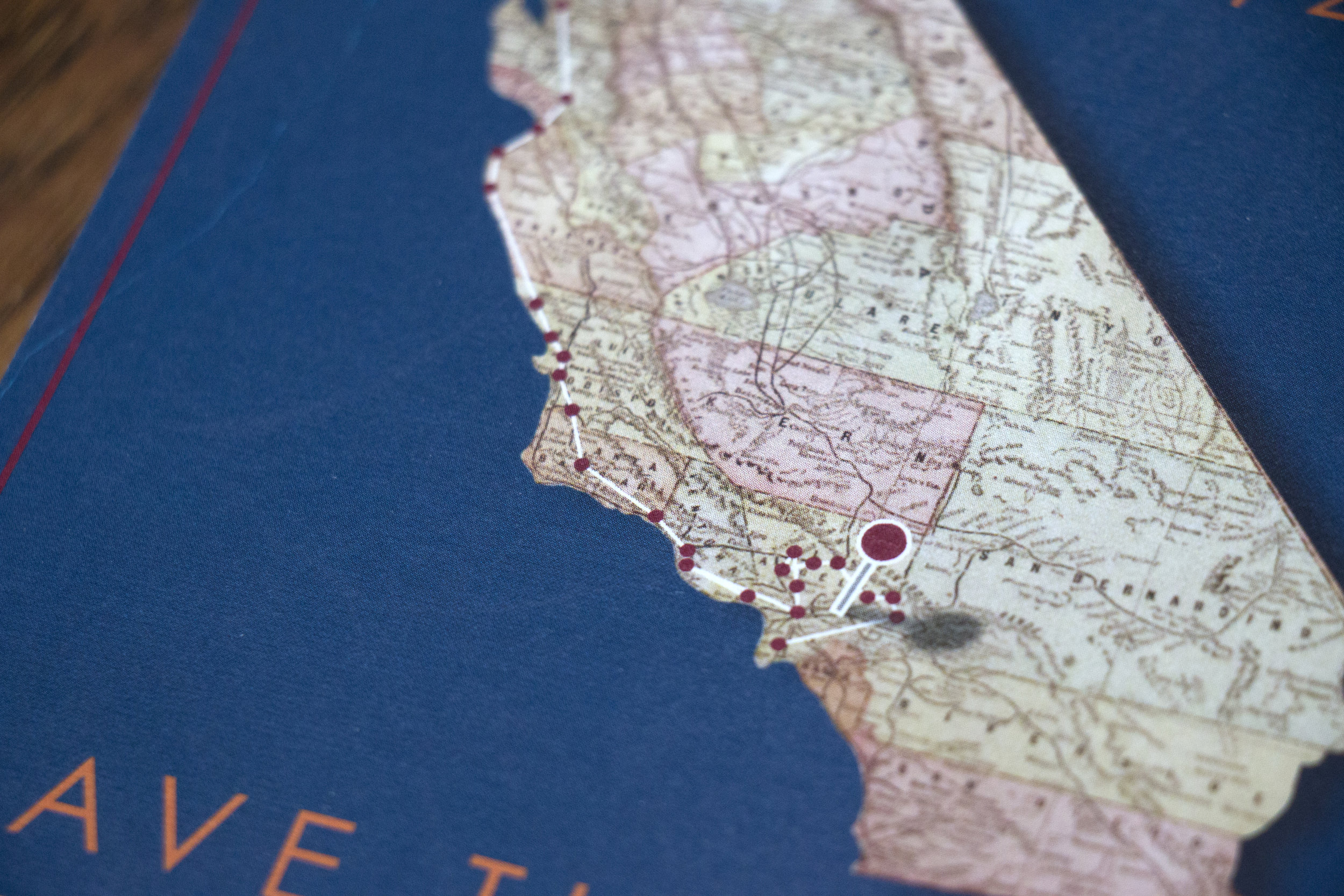
Every red dot represents a stop on the scavenger hunt.

On the back I turned the silhouette of the state into a photo collage from when Michael proposed.

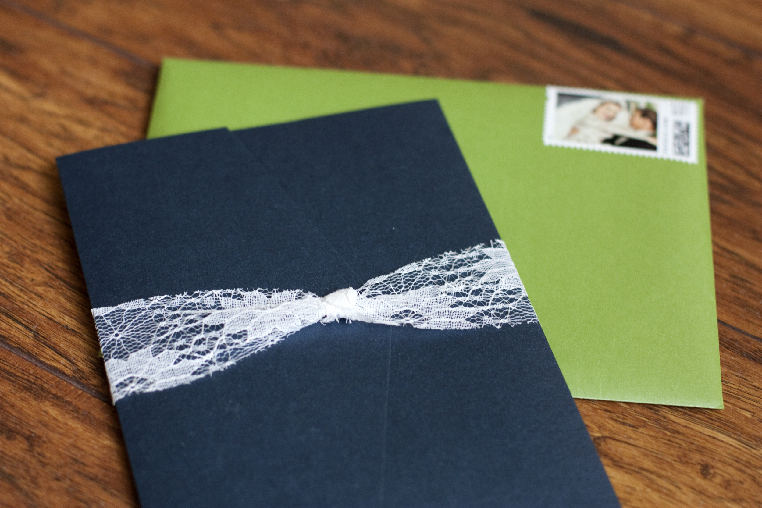
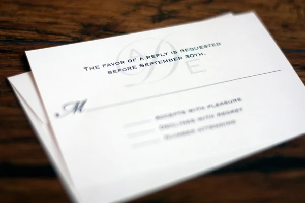
When it was time to design invitations, Jackie wanted to use lace along with their colors. She loved the invitations I created for Erin & John and wanted a similar vibe. 

We went with gate fold cards in Cobalt from Cards and Pockets and they were held closed by a circle that we designed using the same lace motif.

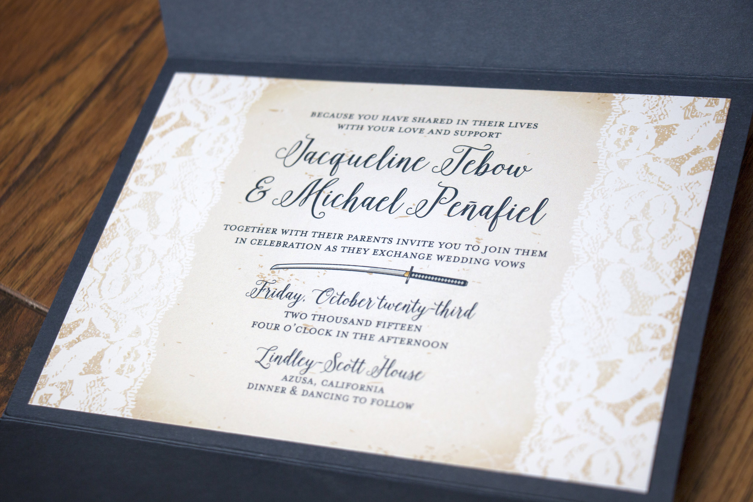
Michael requested that I include a graphic of a samurai sword to represent the honor code he follows with martial arts. He and his groomsmen all carried swords in the wedding ceremony too, it was pretty rad.

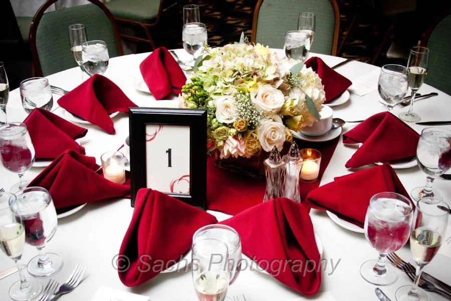
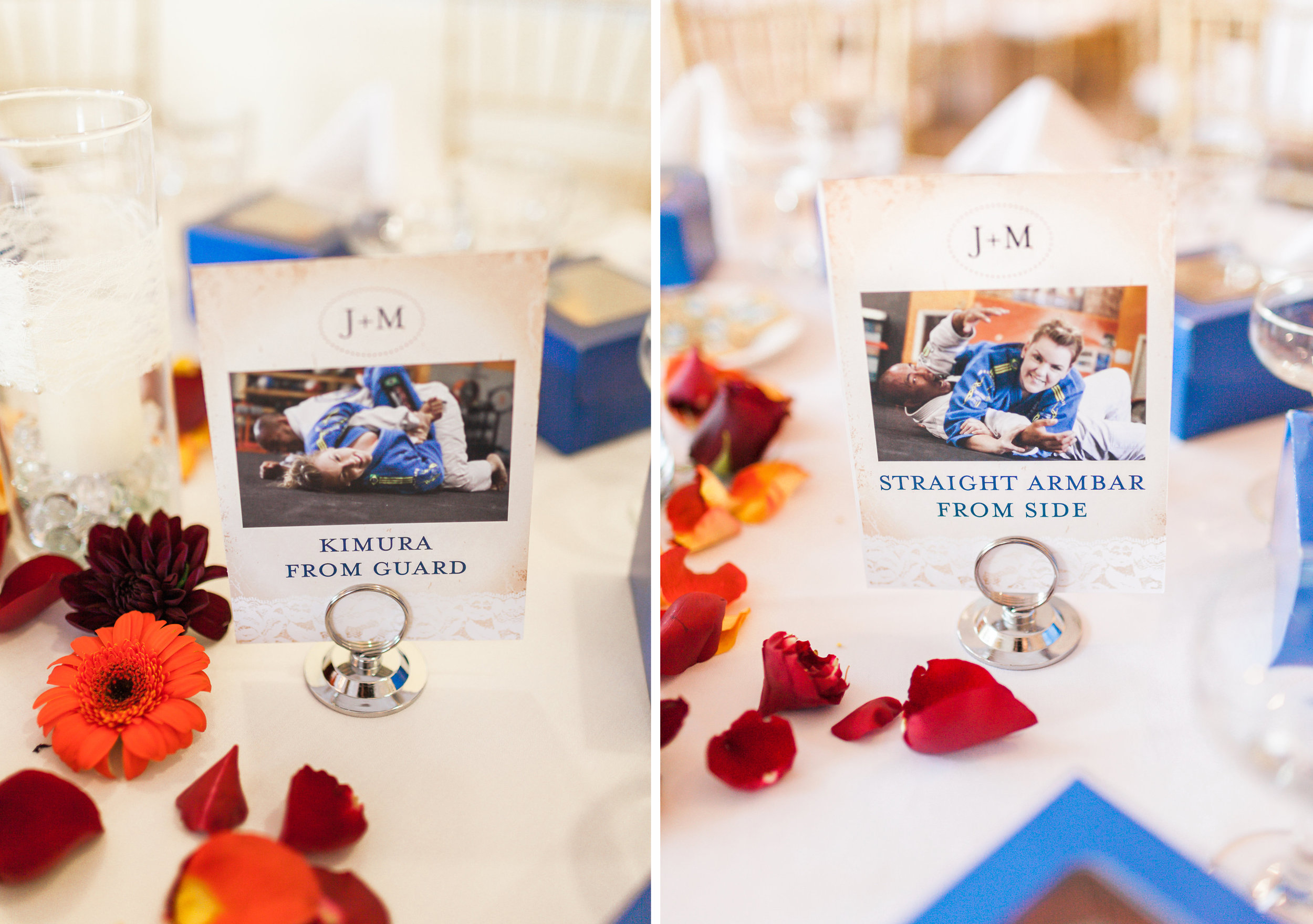
For the big day itself, we created a lot of fun items! First, each of the guest tables was named after a submission move in jujitsu. Jackie and Michael posed in each move and took photos of them all, with Jackie in the winning position. 

The rest of the photos from this post were taken by the very talented Katie Jackson

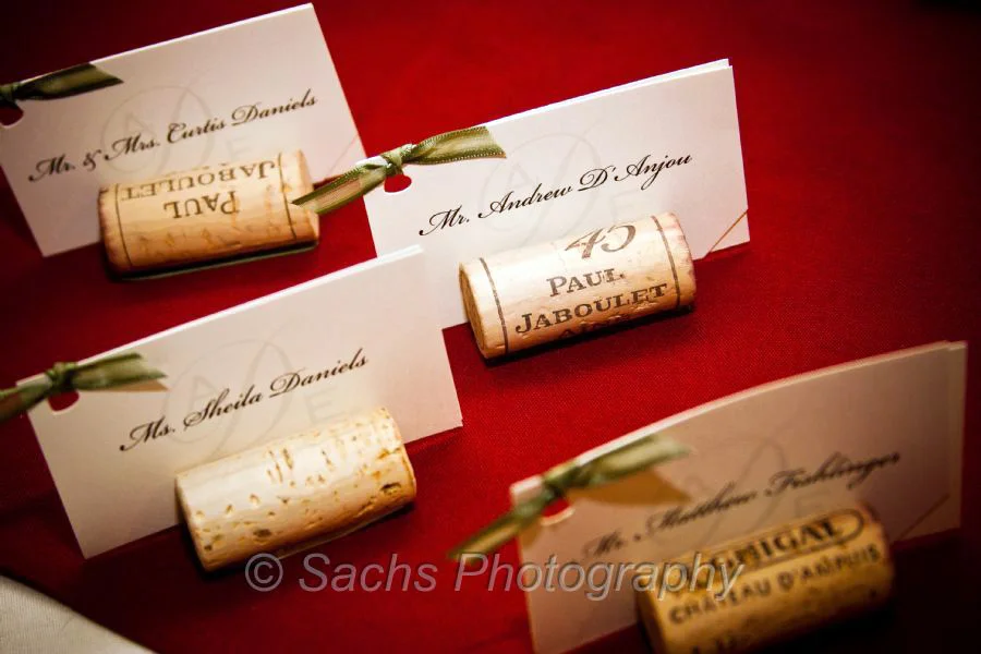
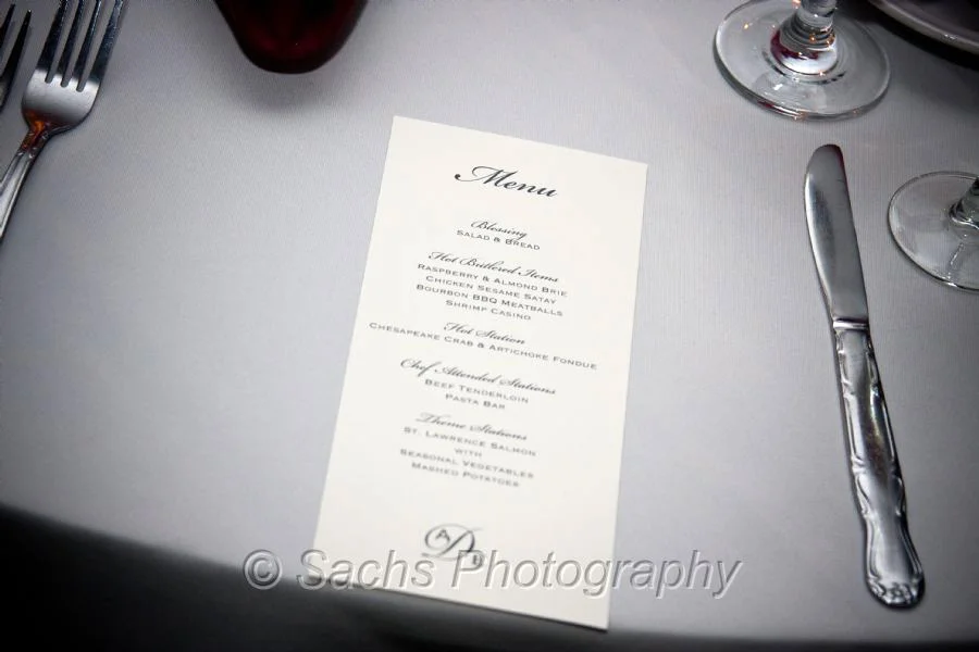
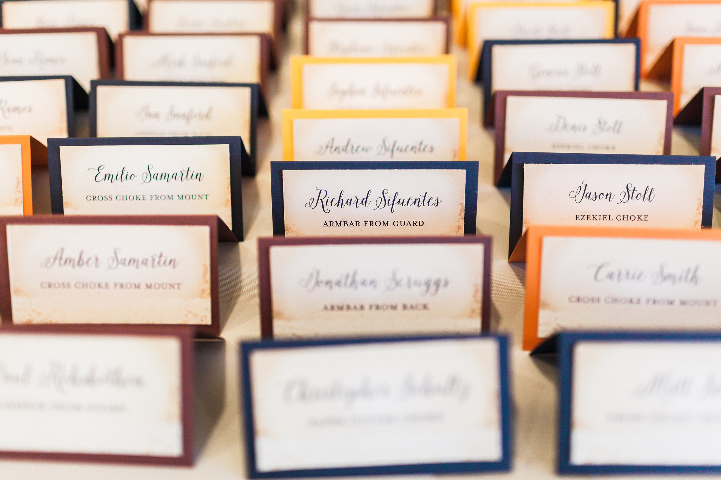
Then, we printed escort cards for each guest directing them where to sit. The folded cards were color coded to indicate to the catering staff what menu item they were having for dinner.

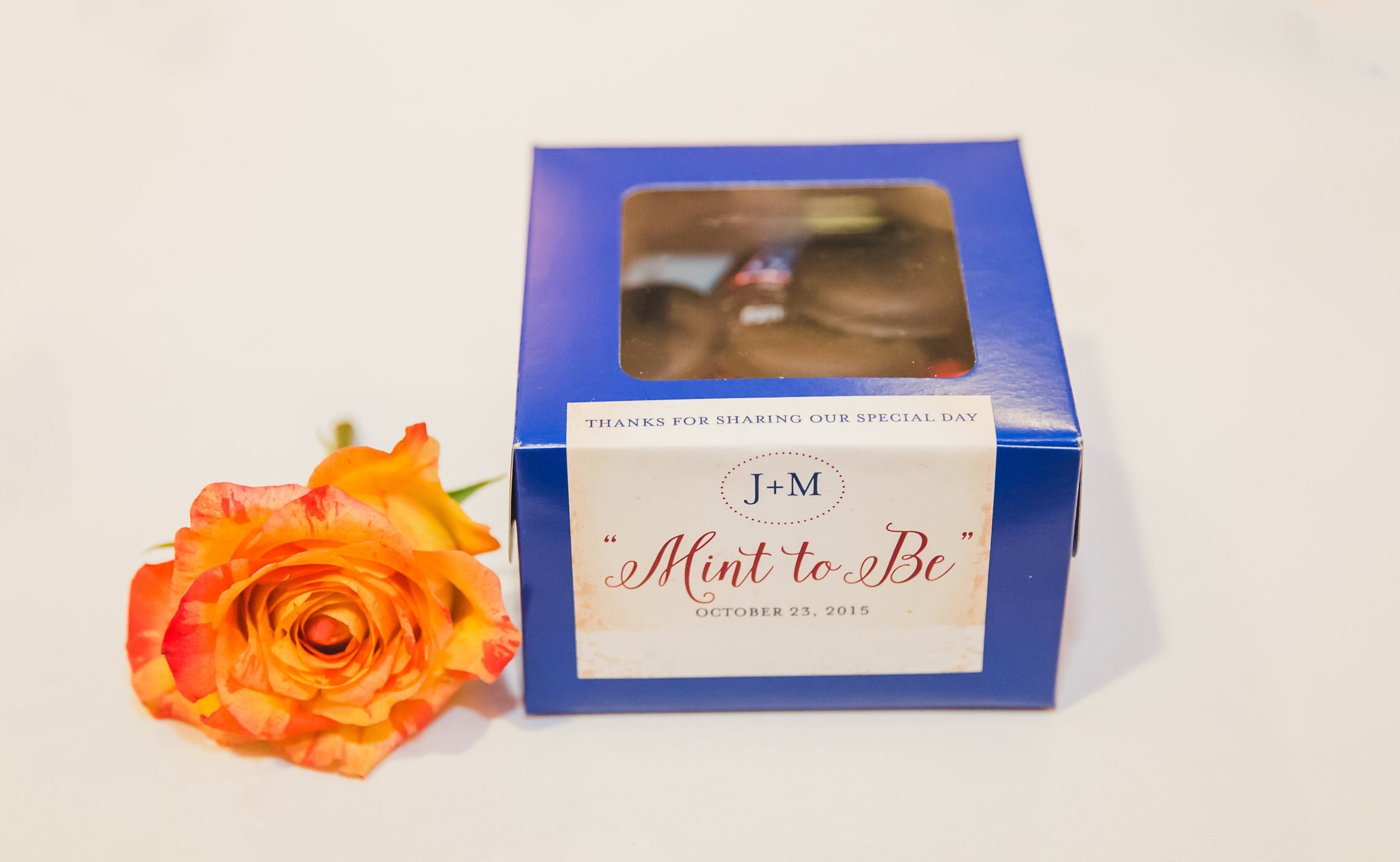
Jackie (a Lifetime Girl Scout) wanted the favors to be Girl Scout Cookies and Michael was more than happy to agree. They each chose their favorite cookie (Thin Mints and Samoas) and placed a couple in individual boxes, each with their own unique label. 

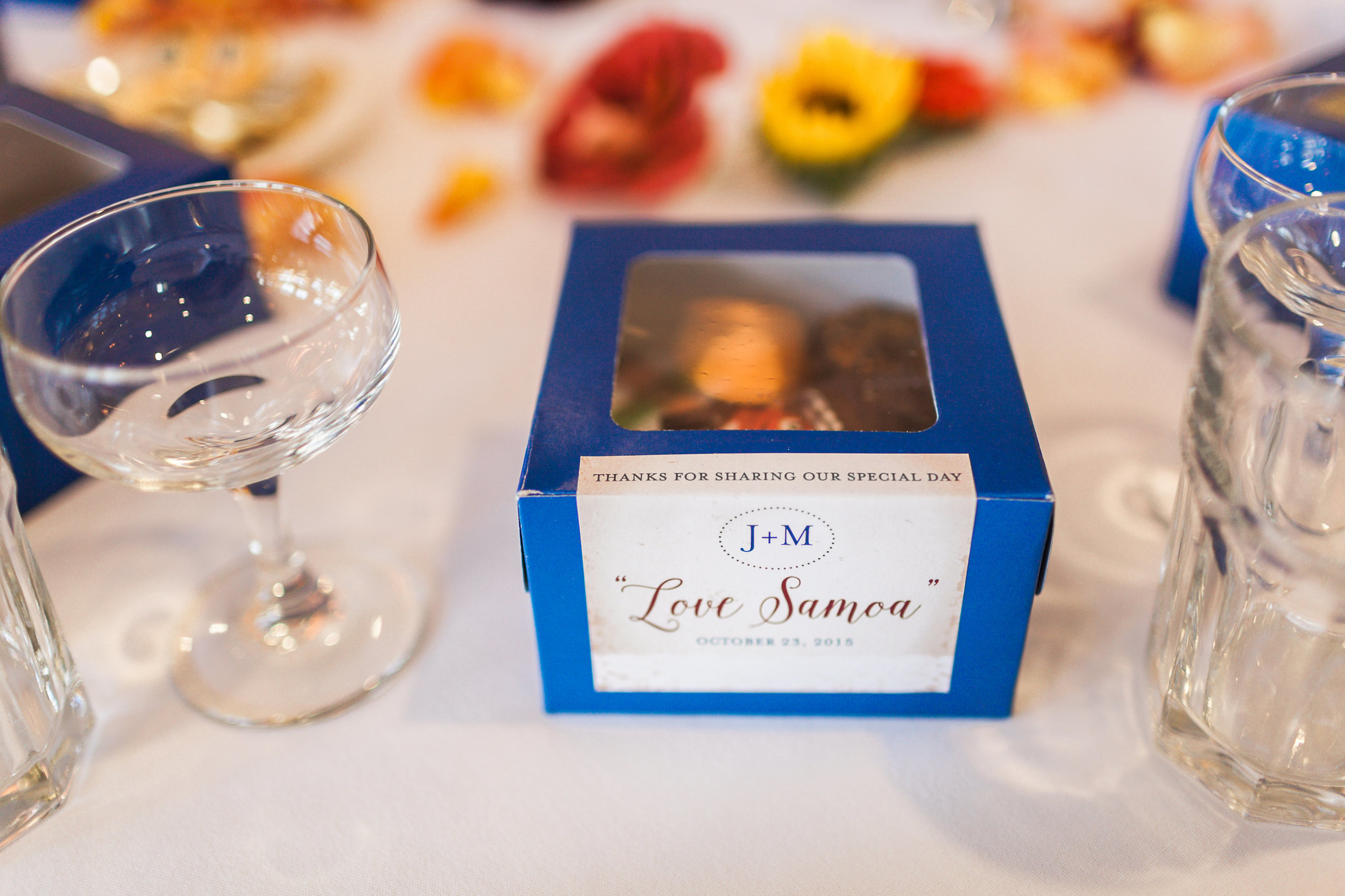
"Love Samoa" and "Mint to Be," get it?! 

This was the sign that adorned their sweetheart table.

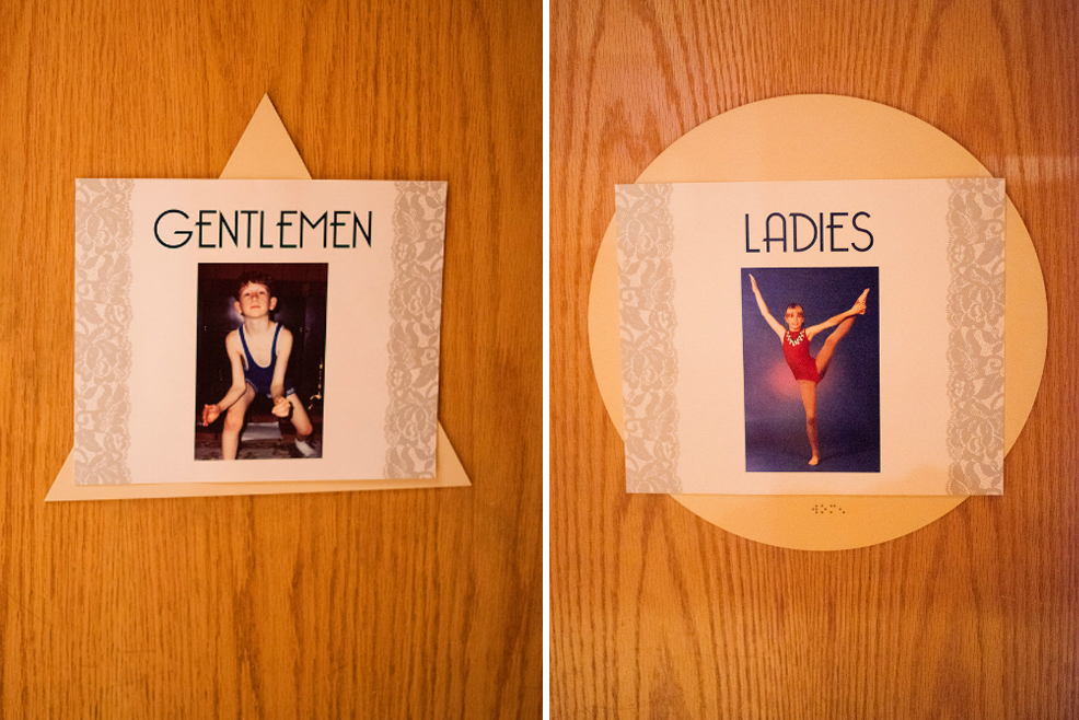
We created a bunch of signs that were placed throughout the reception venue:

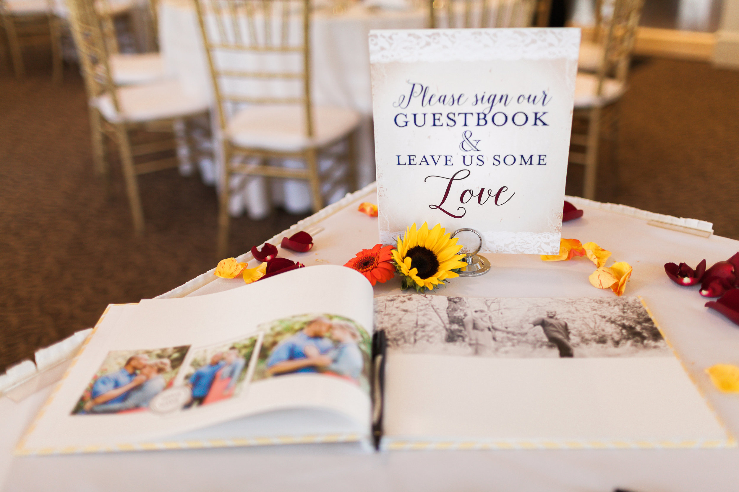
Side note: Jackie and Michael had no idea what they wanted to use for a guestbook. They weren't thrilled about a book that just listed everyone's names, and they don't have space in their home to hang a big print on the wall with everyone's names. I told her I'd take care of it (two weeks before the wedding!). I took all of the engagement photos taken by Katie Jackson and made them into a photobook that had lots of white space on the pages, like a yearbook. That way people could leave their well wishes wherever they wanted. With a coupon through Shutterfly the book was less about $35. This is by far, my favorite way to do a guestbook. I did it for my wedding and I still sometimes thumb through our book almost 10 years later.

Back to photos!

A table set aside in memory of the family and close friends who couldn't be there. This is what the sign says:

In Loving Memory
Those we love don't go away,
They walk beside us every day.
Unseen, unheard, but always near,
Still loved, still missed,
And very dear.

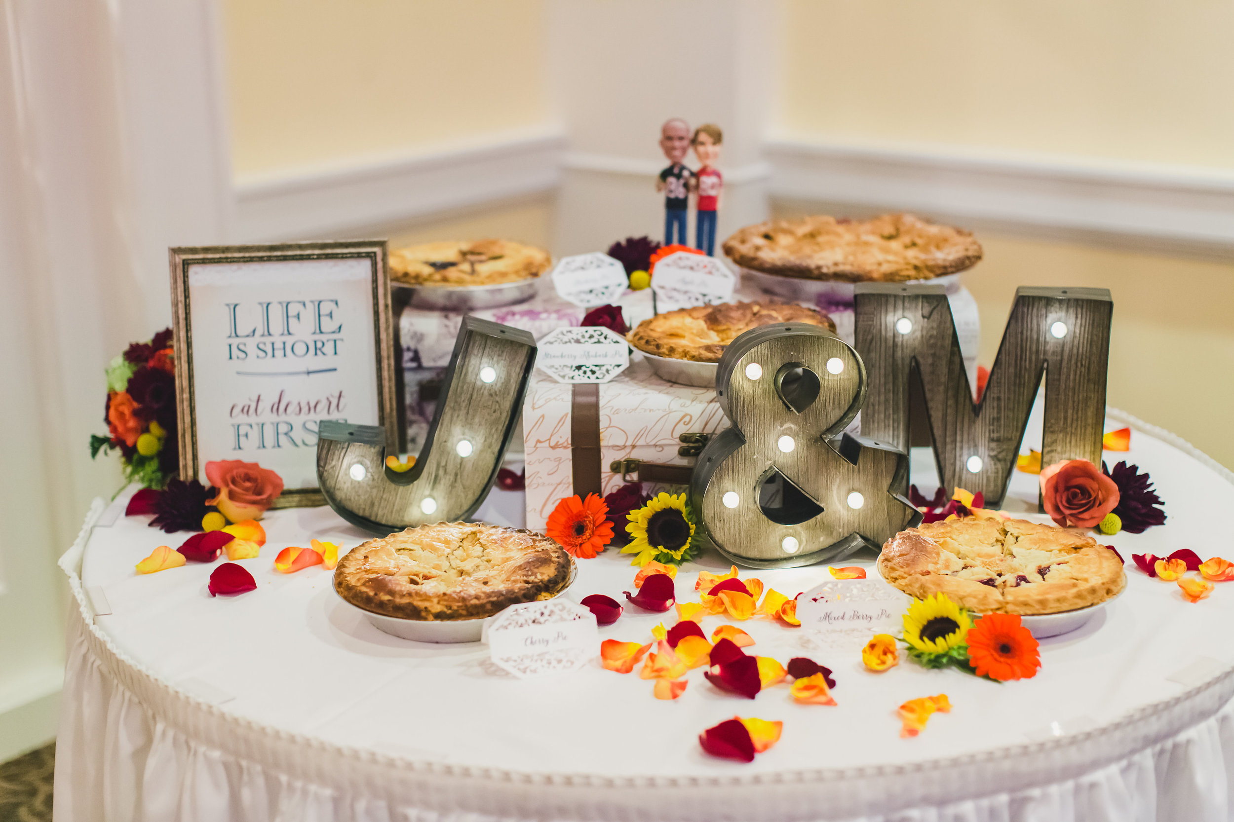
"Life is Short, Eat Dessert First" Jackie doesn't care for cake, so they had wedding pie!! The light-up letters were a last-minute thing too, I love how they turned out!

It was truly an honor to get to design all of these for my little sister and I'm so thrilled with how it all turned out. It was an honor to stand beside you as you said "I do," congratulations!!

A last little gem from Katie Jackson, she really captured our relationship here. Hahaha!

Melissa & Patrick

I had so much fun working with my younger brother and his fiancé on the items for their bicycle-themed wedding. Both Patrick and Melissa are avid athletes, running marathons, triathlons, sprint races, you name it. And they love long bike rides and races, so it was perfectly fitting to have their bicycles throughout their June wedding.

In the beginning of wedding planning, Patrick was very set, he didn't want to use graphics of a tandem bicycle (which are very popular in wedding decor). "We each have our own bikes!" he said. So I created the graphic with two separate bicycles and things took off from there. 

Many, many thanks to Jessica Kay Photography for her stunning images. I don't always get professional images of the work I do since not very many photographers take pictures of the printed details unless the bride or groom specifically asks. But Jessica knew I'd want photos to share and she happily obliged. If you're ever in need of a photographer for weddings, newborn, maternity and family photos in northern California, give her a call!

Their save-the-date introduced guests to the vintage, bicycle theme and included images from their travels together:

Their invitation was a blast to come up with and the folks at FolgerGraphics in Hayward, CA were fantastic with helping us print. More than one custom print shop I contacted said they wouldn't be able to print the bicycles on the gatefold card like I mocked up, but FolgerGraphics was happy to do it for me. And they even scored and folded them all!

We used paper bag colored card stock and envelopes from Paper Source

They opted for a two-sided, postcard rsvp and we had fun with the wording.

Don't freak out, I changed their address!

Don't freak out, I changed their address!

We also included a map to the wedding venue plus information about parking and their wedding website URL:

I created a custom return address stamp with Hello World Stamps. I've worked with Kelly on a few stamps for a few different clients and she's been fantastic! I highly recommend her shop.

I changed their address here too, no worries!

I changed their address here too, no worries!

Escort tags were printed small and clipped to the spokes of a bicycle wheel that Patrick mounted inside a planter. I LOVE how this turned out!

Images by Jessica Kay Photography

Images by Jessica Kay Photography

Each table was named after favorite bike rides throughout California with the sweetheart table named after a bike ride Melissa and Patrick planned to ride in Italy on their honeymoon.

Images by Jessica Kay Photography

Images by Jessica Kay Photography

In lieu of a traditional guest book, they did a "thumbprint tree." I created a bare tree (with bicycles too!) and guests were asked to leave their thumbprint on the tree. It really turned out cute!

Images by Jessica Kay Photography

Images by Jessica Kay Photography

Patrick and Melissa made all of the desserts for their wedding (yes, you read that right, they even made the small cake!). We created signs to identify each dessert plus a bigger sign for the table. Plain white takeout boxes were adorned with a custom sticker to allow guests to take some treats home.

Image by Jessica Kay Photography

Image by Jessica Kay Photography

Images by Jessica Kay Photography

Images by Jessica Kay Photography

We created a custom wine label to go with the Zinfandel that our uncle bottled specially for their wedding along with a fun sign that sat at the bar. The label says "cycling happily ever after" at the top.

Images by Jessica Kay Photography

Images by Jessica Kay Photography

I tried my hand at creating a couple of custom chalkboard signs too. I used the method Mary Ellen used in this tutorial and I created these two signs. The big one served as their wedding program. It was quite a bit less expensive than printing one for each guest.

Old fashioned bicycle bells were the wedding favor. We added a simple sticker and these came out towards the end of the evening. No one wanted to deal with kids ringing these during the ceremony!

This wedding was truly a blast to work on. And I'd like to give some extra special thanks to my husband for his patience as I got the last minute items finished, especially those chalkboards. Oh and I was eight weeks postpartum when this wedding happened, so there's that! We even managed to get a decent family photo!

Images by Jessica Kay Photography

Images by Jessica Kay Photography

Abby & Mark

I had the pleasure of working with both Abby and Mark on the printed items for their summer wedding in Massachusetts. There were nautical stripes, pint glasses, crab and lobsters! And they were gracious enough to share some photos that their wedding photographer got of the items I created.

Here's what we came up with:

It's not easy to see, but there's a crab and a lobster inside the circle of their monogram; an ode to their coastal Massachusetts wedding venue. 

The program was one simple printed card.

Escort cards were simple, they printed every guest's name onto a card with a crab faded into the background. Those cards were clipped together with a matching card that listed their table number and had an image of a lobster in the background. I love the shells they used to pair each set of cards together. And, of course, they're all sitting in sand!

Each table was named after a sailboat owned by a family member at one time. We included the name of the boat along with what type of boat and the year it was built. Since we had a variety of photos (some color, some black and white), we made them all sepia-toned to stay consistent. I love how these turned out!

Lastly, Abby and Mark took the monogram that I created for them and had them printed onto pint glasses that served as favors for each guest. I LOVE these!

Such a fun wedding, congrats guys!

Erin & John

I had a ton of fun working with Erin on the items for her and John's wedding. Erin was kind enough to talk to her photographer, Ben Krantz about taking additional photos of the printed items I worked on. He totally wowed me on the photos he took. 

But first, here's the engagement party invitation. We did a two-sided postcard showcasing a few of the photos John and Erin took while on vacation in Italy (where they got engaged!).

I loved creating a customized "postmark" that listed the date they got engaged.

I have photos of their save-the-date,I just don't remember where they are. I'll update when I find them.

Here's their invitation:

Sapphire pocketfolds are from Cards and Pockets.

I love the accent on the corners. It's amazing how a fun corner punch can transform an invitation.

Many thanks to Ben Krantz Studio for the following photos of the big day. 

Image by Ben Krantz

Image by Ben Krantz

I designed that fun graphic that was projected onto the wall over the dance floor. Rad!

Image by Ben Krantz

Image by Ben Krantz

Each table was given a number and the sign contained photos of both Erin and John when they were that age. So fun!

Image by Ben Krantz

Image by Ben Krantz

Their favors were small bottles of limoncello that a friend made (that friend was also their officiant).

Image by Ben Krantz

Image by Ben Krantz

These signs showed wedding photos from Erin and John's parents and grandparents, including their wedding dates. I thought this was a heartfelt touch for their wedding decor.

Image by Ben Krantz

Image by Ben Krantz

Even the bathrooms showcased fun photos from their childhood.

Images by Ben Krantz

Images by Ben Krantz

Lastly, we used some of the photos from their beautiful wedding to use on their thank you card:

Many thanks to Erin and John for sharing photos from their big day and for asking their photographer to take these for me. I really appreciate it!

Allison & Eion

Allison and Eion were planning a wine-themed, fall wedding, but they specifically didn't want to use graphics of grapes and leaves and vines. Allison discovered a business card that had faux wine rings on them and she was hooked. 

These were so much fun to work on!

We kept the invitation itself simple. I love the wine-colored envelopes and sage green satin ribbon. So elegant!

We added wine rings to the inserts.

The program was simple; just a piece of card stock folded in half.

Image by Sachs Photography

Image by Sachs Photography

Escort cards were done in pairs. The front card listed the guest's name and the second card listed their table.

Image by Sachs Photography

Image by Sachs Photography

Table numbers with wine rings.

Image by Sachs Photography

Image by Sachs Photography

A menu was placed at each place setting.

Image by Sachs Photography

Image by Sachs Photography

We created a sign for the candy buffet.

Image by Sachs Photography

Image by Sachs Photography

And a super fun door knob sign!

Image by Sachs Photography

Image by Sachs Photography

Everything turned out beautiful and special thanks to Allison and her wedding photographer, Sachs Photography, for sharing some lovely photos.