wine label

Bev and Jon

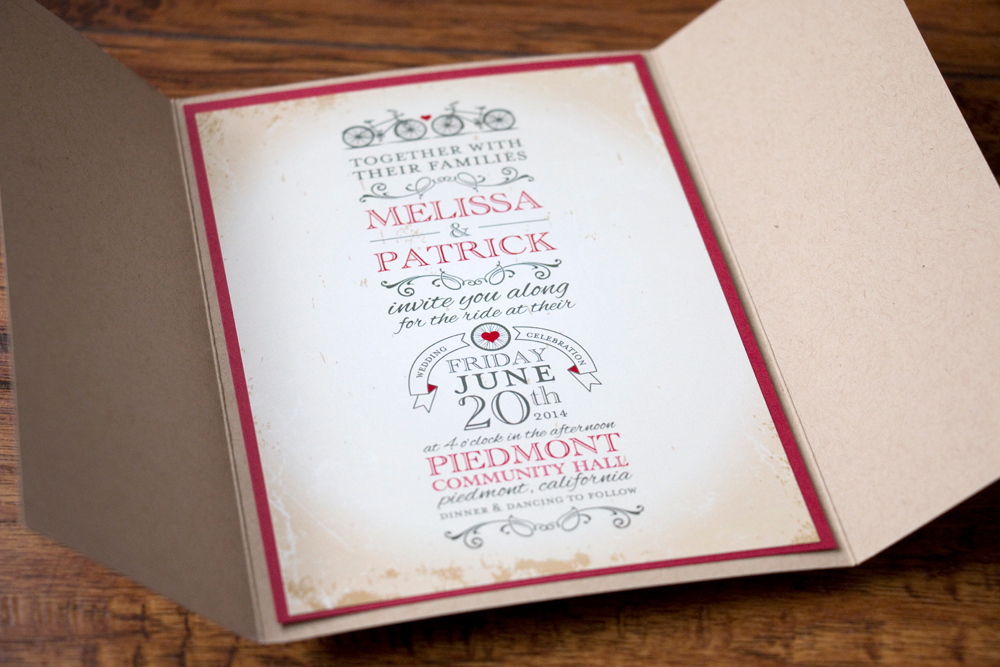
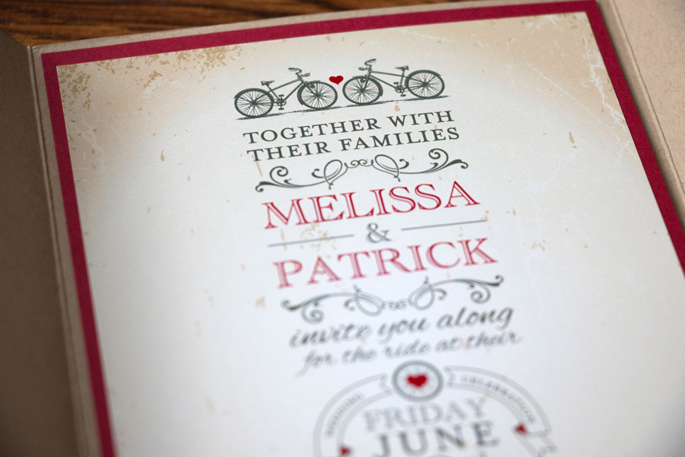
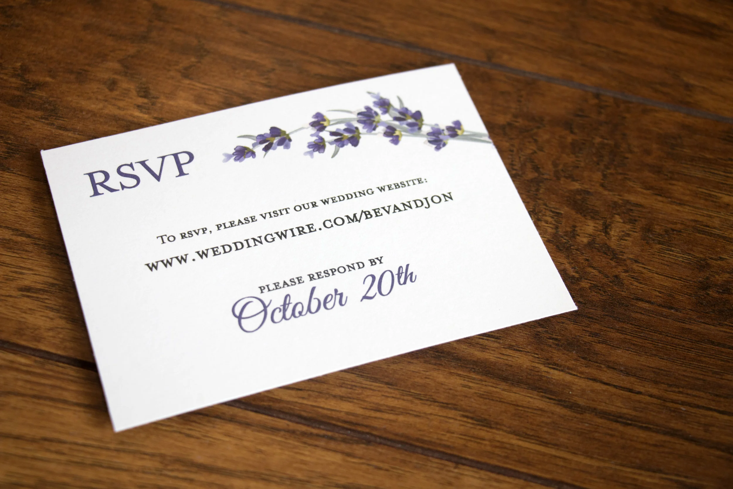
My dear cousin Bev got married to Jon a year ago this week and I was honored to create their wedding invitations. They were planning to use lavender as one of the primary flowers, so we used a lavender design on the printed items for the big day. Here’s their invitation:

Bev & Jon Lavender Wedding Invitation

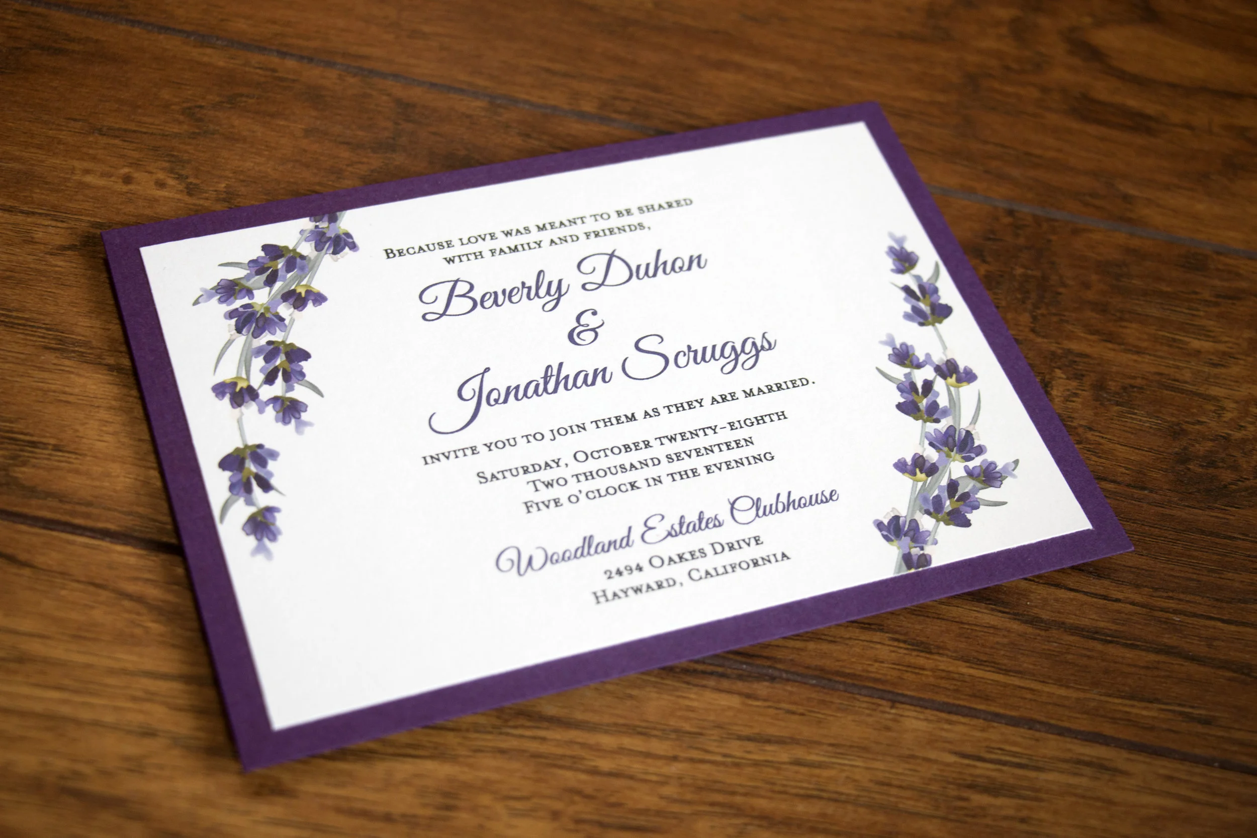
They invitations were printed at my local Office Depot and backed with metallic card stock in the color Violette from Cards & Pockets.

Bev & Jon Lavender Wedding Invitation

Invitations were mailed in metallic envelopes in the Light Amethyst color from Cards & Pockets. As a surprise to Bev and Jon, I had a custom return address stamp made with Kelly from Hello World Stamps. This one got a little smudged, but it was my last of the purple envelopes!

*That’s not their address anymore, which reminds me that I need to have a new stamp made.

*That’s not their address anymore, which reminds me that I need to have a new stamp made.

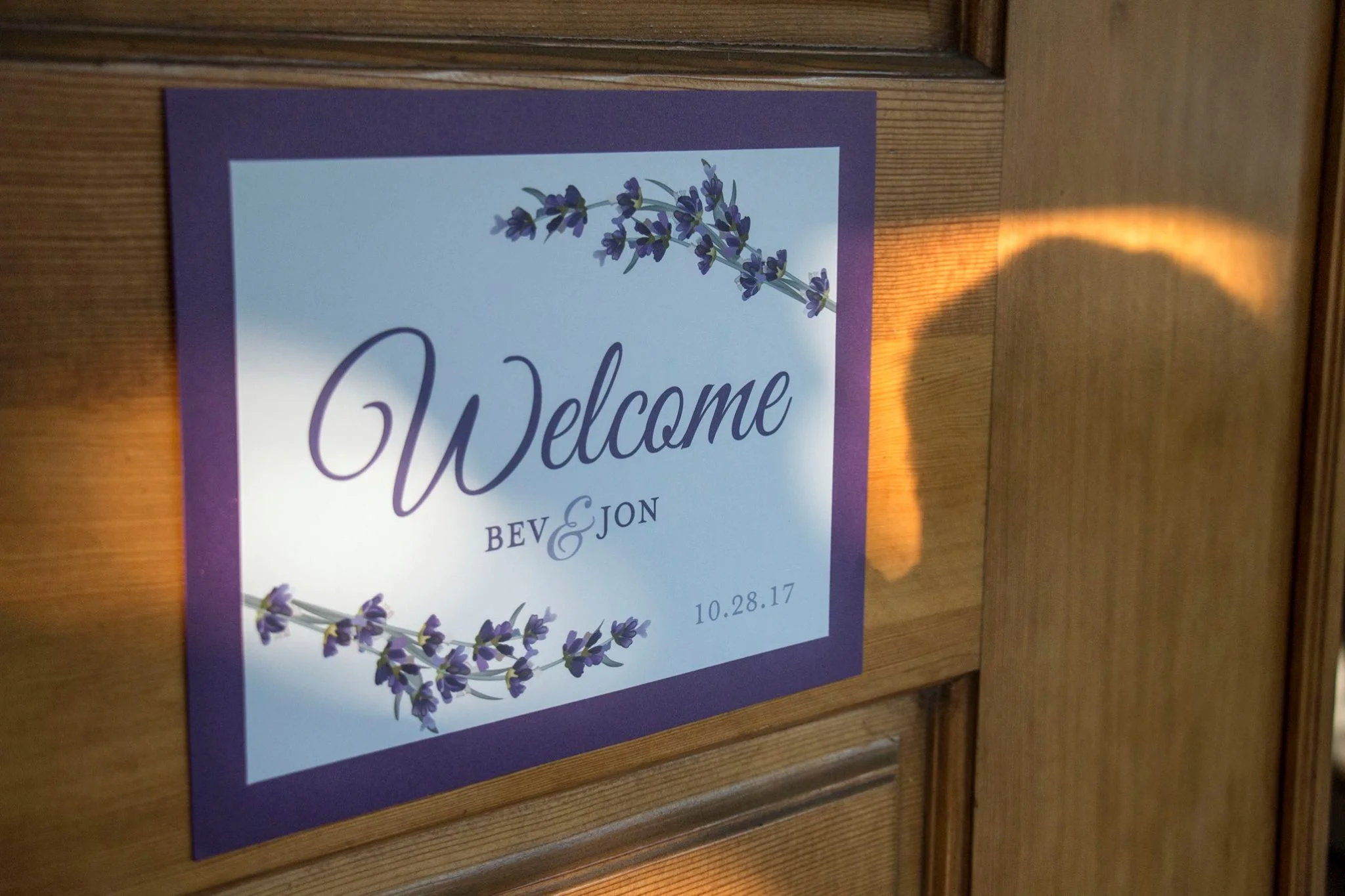
We also made a sign for the front door of the wedding venue, it was backed with the same Violette card stock as the invitations:

Bev & Jon Lavender Wedding Sign

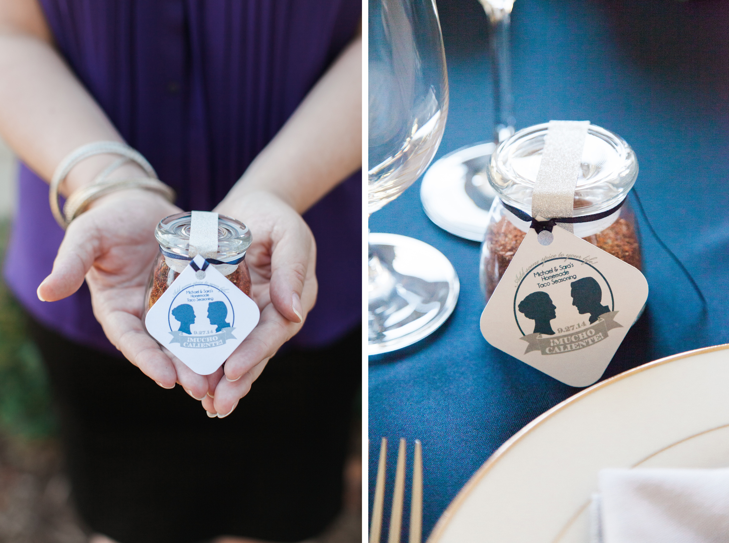
For favors, they stuck their favorite candies into lavender mesh bags and included mini bottles of liquor, yum! We created a sticker for the tops of the mini mason jars.

Bev & Jon Lavender Wedding Favor Tag
Ben & Jon Lavender Wedding Custom Wine Label

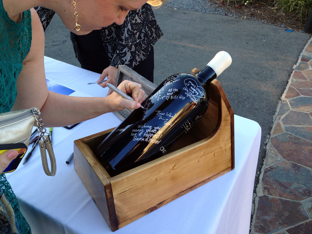
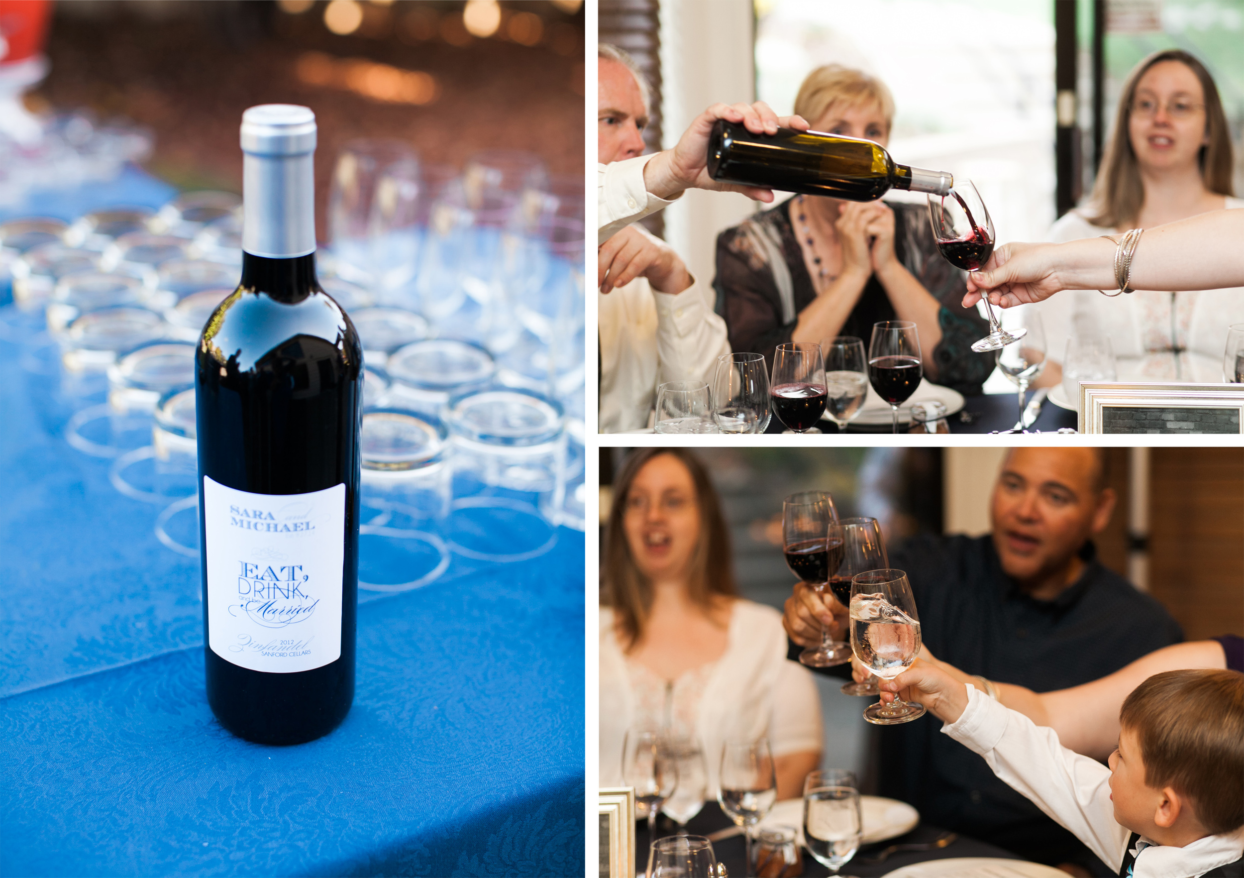
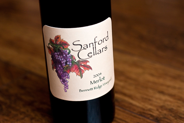
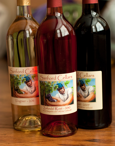
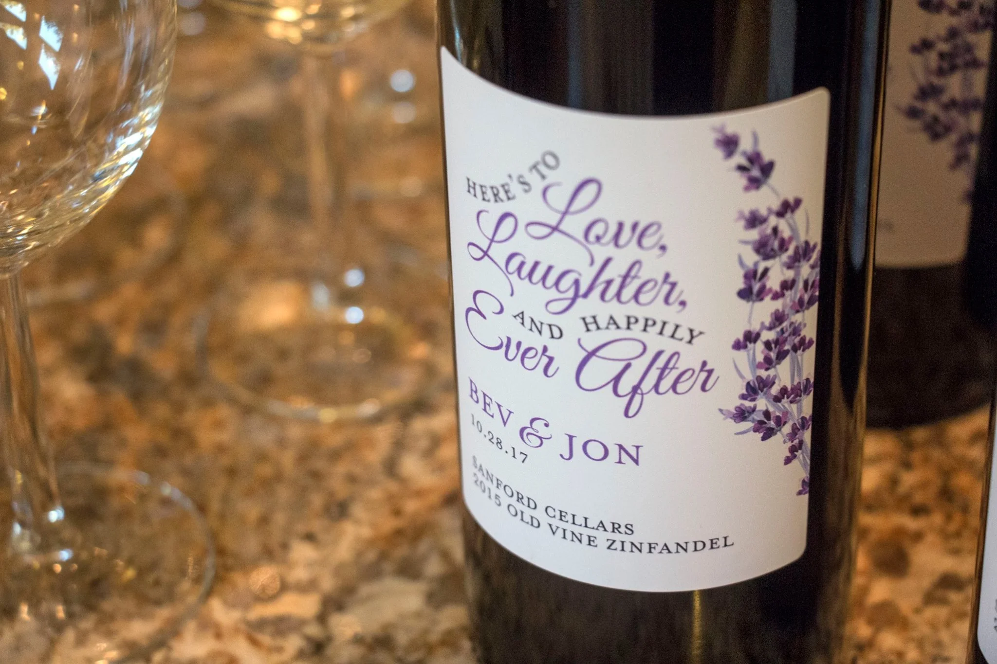
Lastly, Bev’s stepdad is a winemaker and bottled a bunch of his Old Vine Zinfandel for the wedding and asked me to design a custom label as a surprise to Bev and Jon. I love how it turned out!

Ben & Jon Lavender Wedding custom wine label

I love how everything turned our for your beautiful wedding, congrats on your first anniversary!!

Cindy & Scott

Cindy and Scott were planning a beautiful mid-October winery wedding in northern California and wanted to use simple and straightforward designs for their wedding invitations. I was more than happy to oblidge!

First we created a simple save-the-date with a chalkboard background. Cindy had these printed with VistaPrint. The matte finish really showcased the chalkboard texture.

When we got started with the invitation, they wanted to keep the same overall look with a chalkboard background, but incorporate their wedding colors: blue and gray. 

These were printed by FolgerGraphics in Hayward, CA. 

For a response card, Scott had fun creating a Mad Lib for guests to fill out. This was really fun to create for them!

The response card was a simple two-sided postcard. Their address has been changed to protect privacy.

For their wedding day, Cindy's dad (who's a wine maker), bottled his delicious Zinfandel Rosé for guests to toast with and I designed a custom label to go with them. Waterproof labels kept them from wilting when the wine was chilled.

In lieu of a traditional guestbook, Cindy's dad went above and beyond and had a giant wine bottle filled with his delicious Zinfandel wine and engraved with the same label design. He then built a wood mount for the bottle that allowed it to be spun without risk of it rolling off of the table. Guests signed with metallic silver Sharpie markers. This turned out SO cool!! 

The bottling, engraving, and painting was done by Doc's Trophy Shoppe in Napa Valley, CA. They did an amazing job!

Cindy and Scott's wedding was a blast and I really appreciate the invite. Congrats!!

Sara and Michael

The youngest of my two brothers got married last September with a small ceremony. They were originally planning to get married the following year but chose to get hitched sooner and they only gave themselves five weeks to plan it. Five weeks!!

We were tremendously lucky that Jessica from Jessica Kay Photography happened to be free that weekend and was able to come and shoot their wedding. Thank you Jess!!!

Needless to say, sending a formal invitation was really just a formality. They invited each of their guests either in person or over the phone and then mailed an invitation to those who were coming. 

We created a thank you note that was placed at each place setting:

Image by Jessica Kay Photogtaphy

Image by Jessica Kay Photogtaphy

Image by Jessica Kay Photography

Image by Jessica Kay Photography

For favors, Sara and Michael made a big batch of their favorite homemade taco seasoning and divvied it into small jars. We added silver sparkly washi tape to secure the lids (they popped right off!) and tied a favor tag to the top. 

Images by Jessica Kay Photography

Images by Jessica Kay Photography

For their guestbook, they had guests write well wishes on Jenga pieces. This was such a FUN guestbook!! The sign on the table says: Marriage is a game of balance. Please leave your words of wisdom on a block and help us build our future.

Images by Jessica Kay Photography

Images by Jessica Kay Photography

My son was so proud to write his name on a block!

Images by Jessica Kay Photography

Images by Jessica Kay Photography

Our uncle (who makes wine) bottled some delicious zinfandel for this special occasion and I created a custom wine label to go with it.

Images by Jessica Kay Photography

Images by Jessica Kay Photography

Lastly, there were bright blue signs on each of the bathroom doors at the venue, and they were kind of in the middle of the space where the ceremony was taking place, so I quickly cut out big silhouettes of Michael and Sara and we taped them over the signs on the door. It was a super last minute thing, but I really love how it turned out.

It was quite an experience getting to play a small role in the planning of this beautiful wedding. Congratulations!

Melissa & Patrick

I had so much fun working with my younger brother and his fiancé on the items for their bicycle-themed wedding. Both Patrick and Melissa are avid athletes, running marathons, triathlons, sprint races, you name it. And they love long bike rides and races, so it was perfectly fitting to have their bicycles throughout their June wedding.

In the beginning of wedding planning, Patrick was very set, he didn't want to use graphics of a tandem bicycle (which are very popular in wedding decor). "We each have our own bikes!" he said. So I created the graphic with two separate bicycles and things took off from there. 

Many, many thanks to Jessica Kay Photography for her stunning images. I don't always get professional images of the work I do since not very many photographers take pictures of the printed details unless the bride or groom specifically asks. But Jessica knew I'd want photos to share and she happily obliged. If you're ever in need of a photographer for weddings, newborn, maternity and family photos in northern California, give her a call!

Their save-the-date introduced guests to the vintage, bicycle theme and included images from their travels together:

Their invitation was a blast to come up with and the folks at FolgerGraphics in Hayward, CA were fantastic with helping us print. More than one custom print shop I contacted said they wouldn't be able to print the bicycles on the gatefold card like I mocked up, but FolgerGraphics was happy to do it for me. And they even scored and folded them all!

We used paper bag colored card stock and envelopes from Paper Source

They opted for a two-sided, postcard rsvp and we had fun with the wording.

Don't freak out, I changed their address!

Don't freak out, I changed their address!

We also included a map to the wedding venue plus information about parking and their wedding website URL:

I created a custom return address stamp with Hello World Stamps. I've worked with Kelly on a few stamps for a few different clients and she's been fantastic! I highly recommend her shop.

I changed their address here too, no worries!

I changed their address here too, no worries!

Escort tags were printed small and clipped to the spokes of a bicycle wheel that Patrick mounted inside a planter. I LOVE how this turned out!

Images by Jessica Kay Photography

Images by Jessica Kay Photography

Each table was named after favorite bike rides throughout California with the sweetheart table named after a bike ride Melissa and Patrick planned to ride in Italy on their honeymoon.

Images by Jessica Kay Photography

Images by Jessica Kay Photography

In lieu of a traditional guest book, they did a "thumbprint tree." I created a bare tree (with bicycles too!) and guests were asked to leave their thumbprint on the tree. It really turned out cute!

Images by Jessica Kay Photography

Images by Jessica Kay Photography

Patrick and Melissa made all of the desserts for their wedding (yes, you read that right, they even made the small cake!). We created signs to identify each dessert plus a bigger sign for the table. Plain white takeout boxes were adorned with a custom sticker to allow guests to take some treats home.

Image by Jessica Kay Photography

Image by Jessica Kay Photography

Images by Jessica Kay Photography

Images by Jessica Kay Photography

We created a custom wine label to go with the Zinfandel that our uncle bottled specially for their wedding along with a fun sign that sat at the bar. The label says "cycling happily ever after" at the top.

Images by Jessica Kay Photography

Images by Jessica Kay Photography

I tried my hand at creating a couple of custom chalkboard signs too. I used the method Mary Ellen used in this tutorial and I created these two signs. The big one served as their wedding program. It was quite a bit less expensive than printing one for each guest.

Old fashioned bicycle bells were the wedding favor. We added a simple sticker and these came out towards the end of the evening. No one wanted to deal with kids ringing these during the ceremony!

This wedding was truly a blast to work on. And I'd like to give some extra special thanks to my husband for his patience as I got the last minute items finished, especially those chalkboards. Oh and I was eight weeks postpartum when this wedding happened, so there's that! We even managed to get a decent family photo!

Images by Jessica Kay Photography

Images by Jessica Kay Photography

Twin Castle Cellars Wine Label

I created this wine label for a very small vintner in the Livermore Valley in California. She wanted to use an illustration of a pair of castles that are close to where she grew up in the label. She grew up near Manderschied, Germany and used to play in these castles when she was a little girl.

Here's what I came up with: 

I created the image using watercolor along with pen and ink. Then I scanned the illustration and added the text in Photoshop. 

I really love how it turned out, and when it's printed on a textured, adhesive paper, it looks like an original watercolor.