weddings

Latiffe & Chris

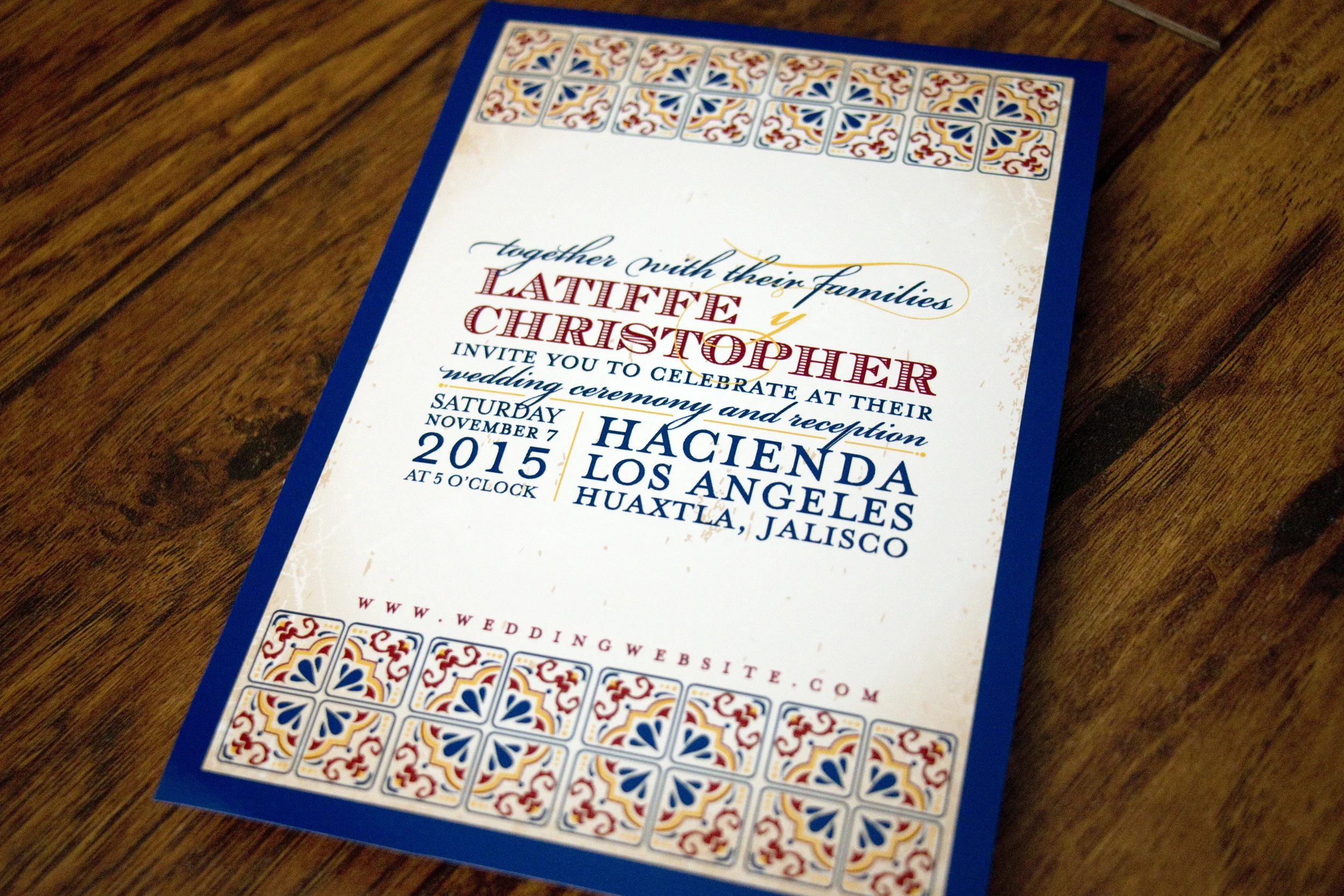
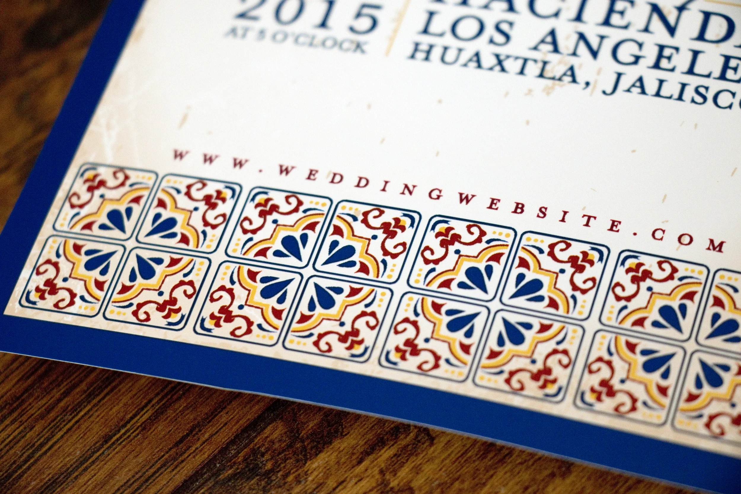
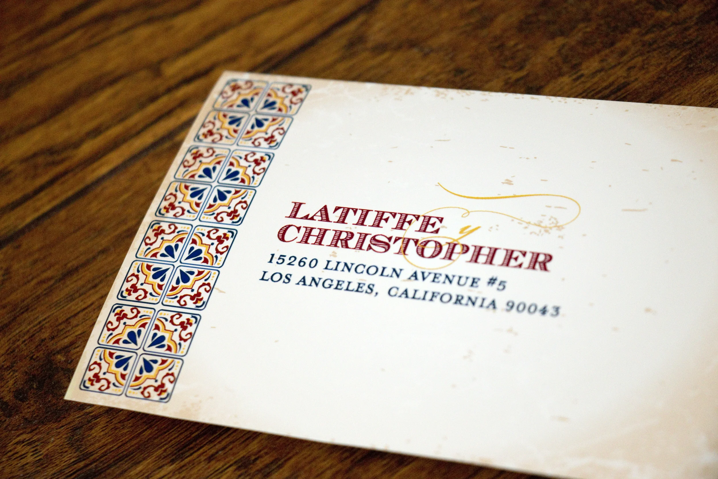
Latiffe and Chris had a gorgeous destination wedding in Guadalajara, Mexico and they wanted their invitations to reflect that in style. We discussed using papel picado graphics, but in the end decided on using Talavera tile as the graphic inspiration. I adore how everything turned out!

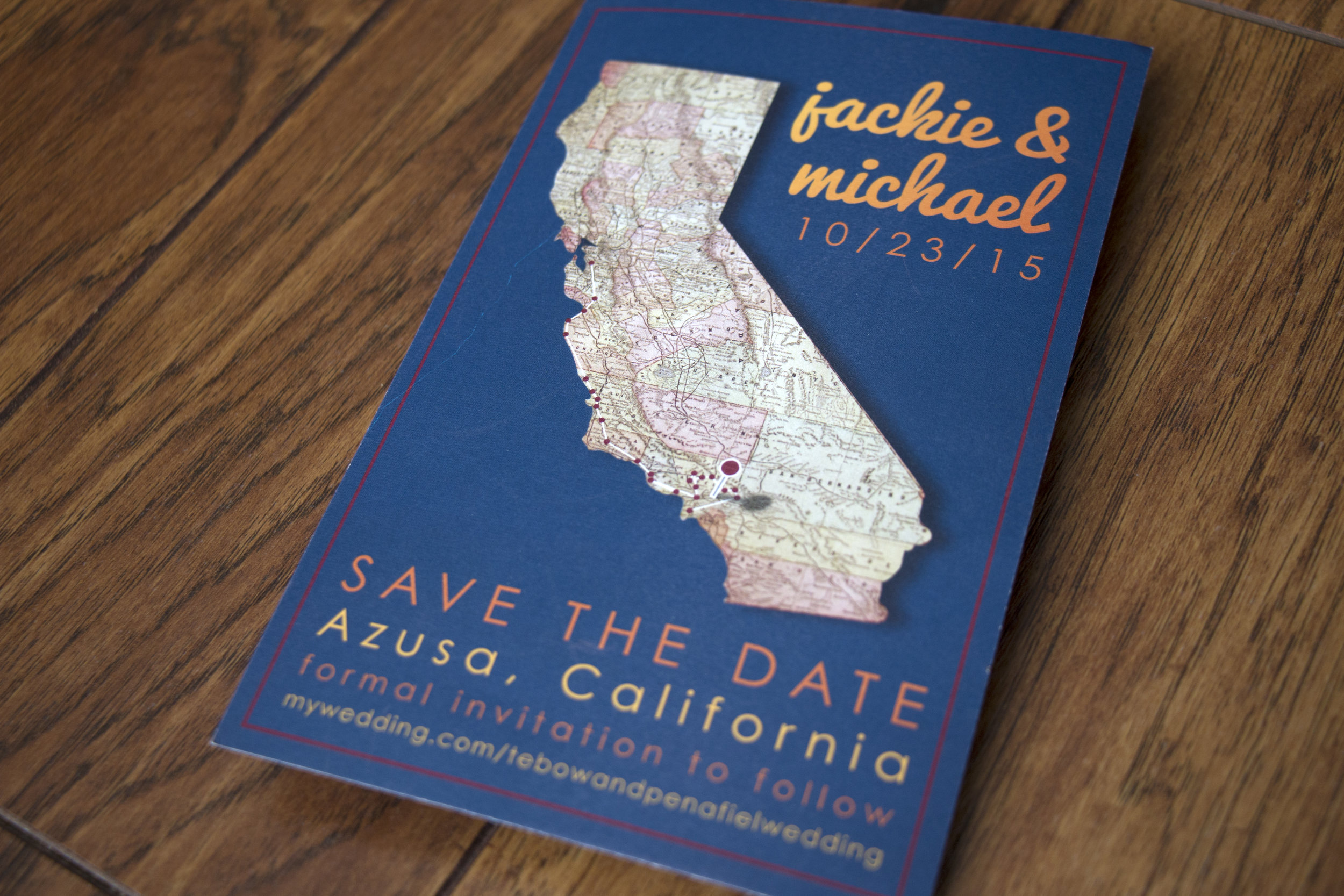
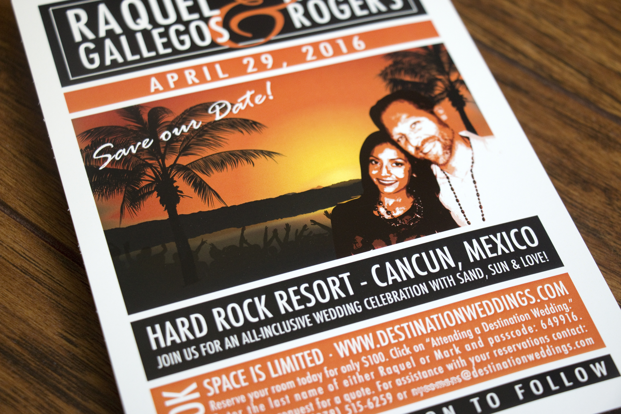
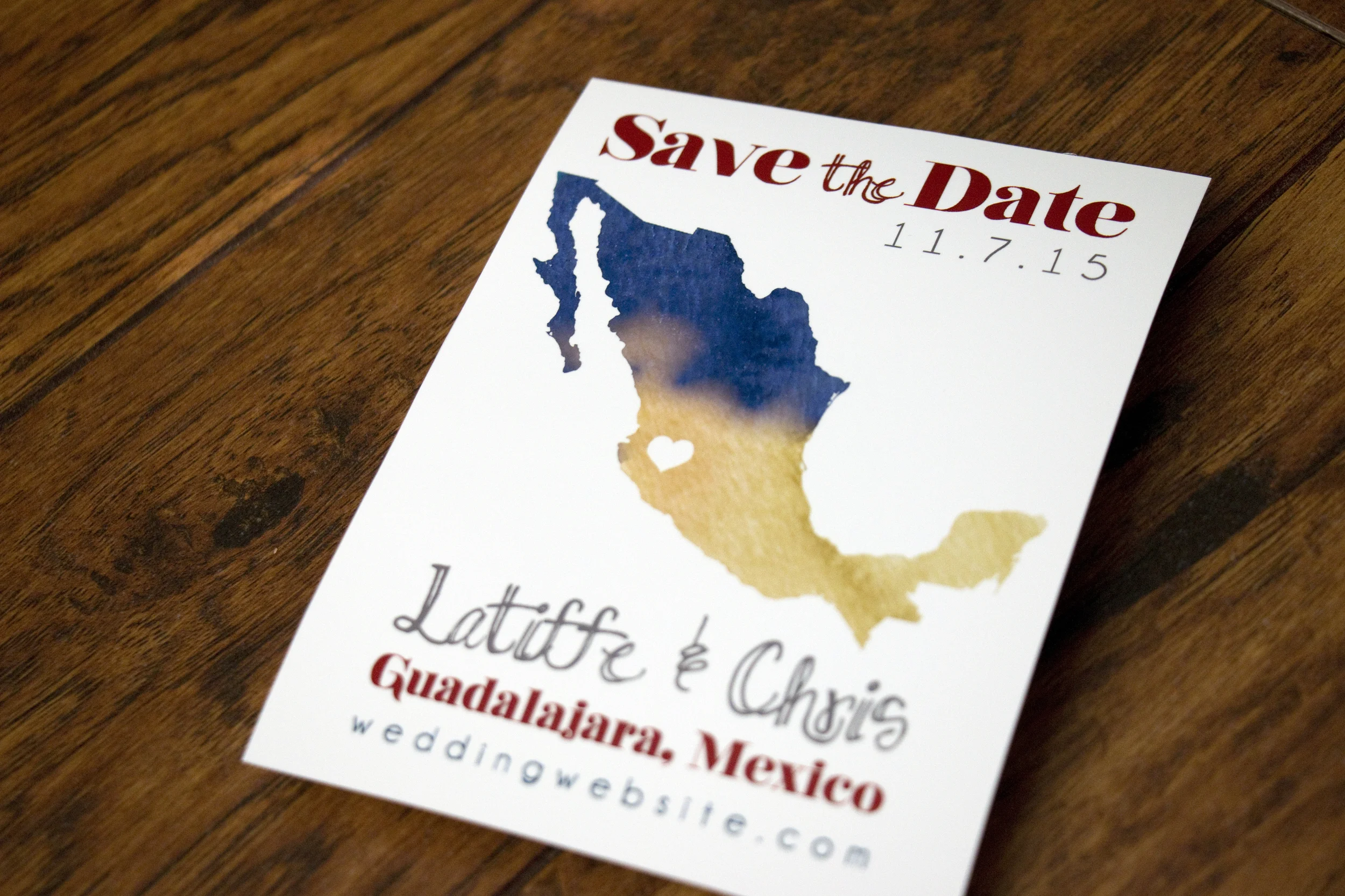
But first, here's the save-the-date we created for them. They wanted a simple silhouette of Mexico with an indication on where the wedding would take place.

Talavera style pottery comes from Puebla, Mexico (where Latiffe's family is from) and is known for bright colors, geometric designs and for having a white base glaze. It was a wonderful inspiration for this invitation and really fun looking at a variety of beautiful pieces for inspiration.

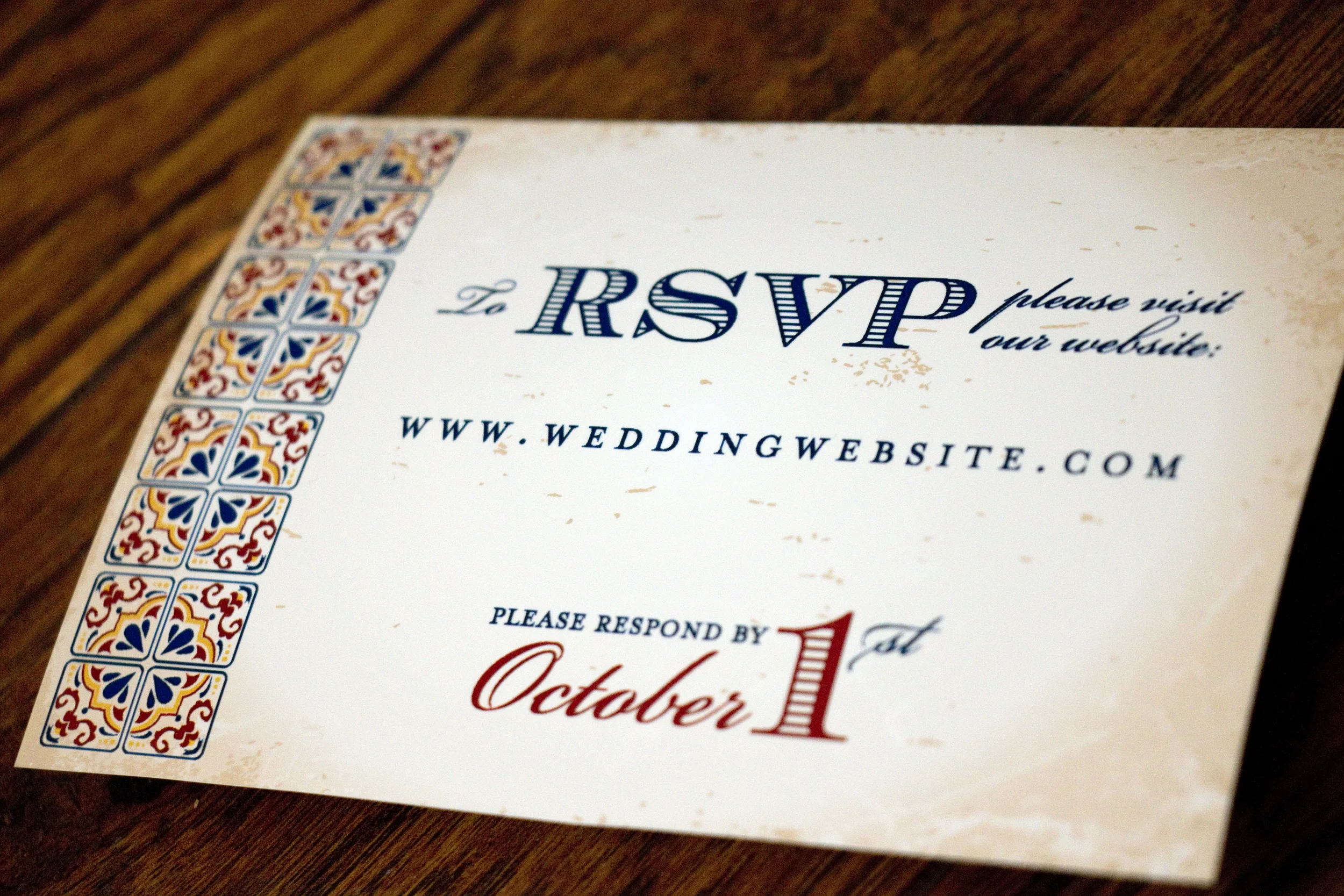
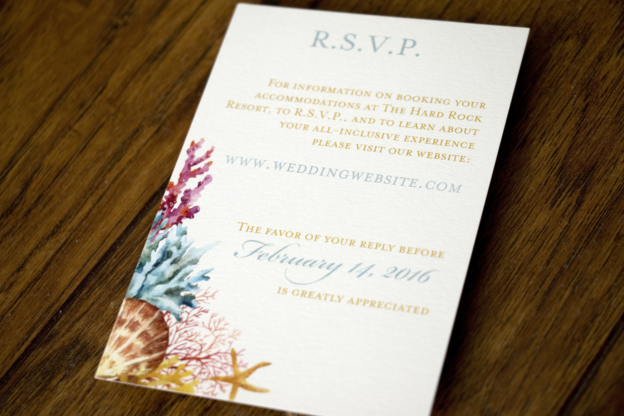
For their RSVP card, we did a very simple, two-sided postcard that directed guests to RSVP on the couple's wedding website. I've changed the URL and their address to protect privacy.

Don't worry, I changed their address!

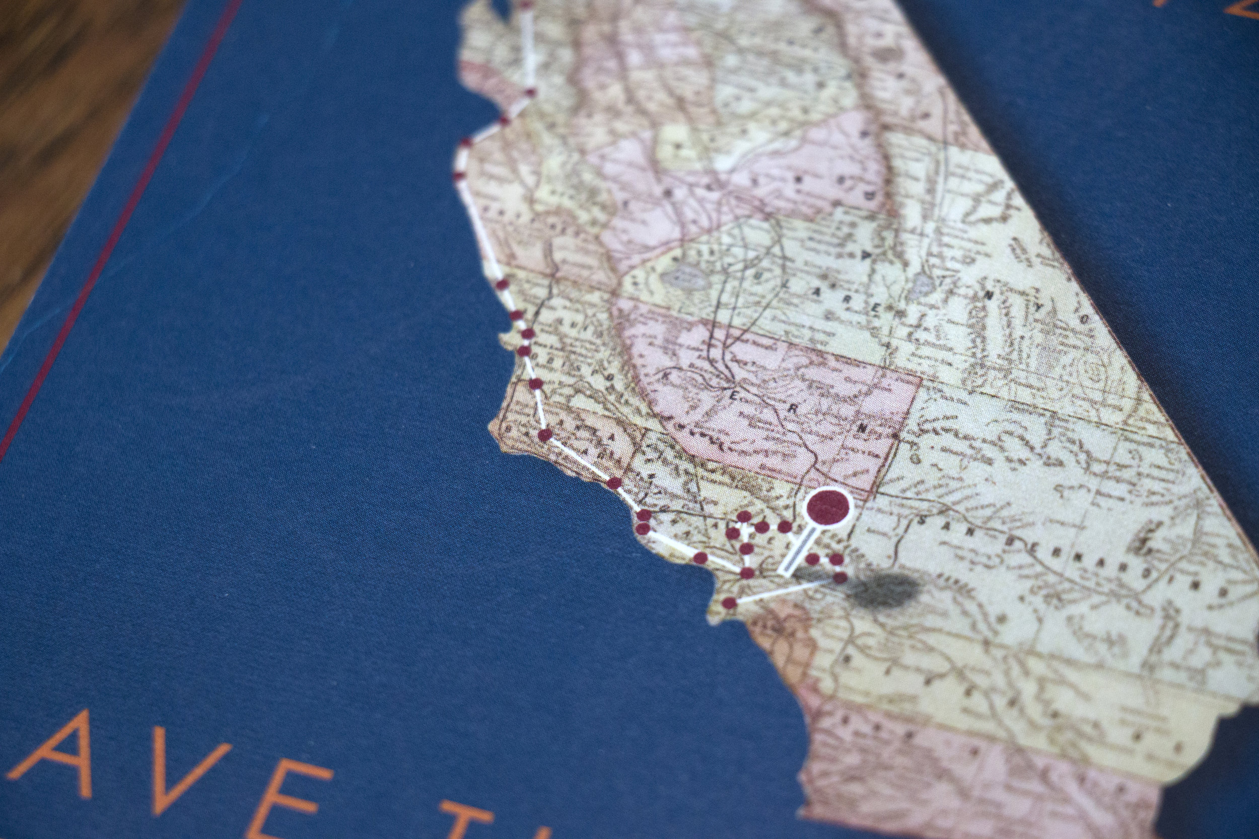
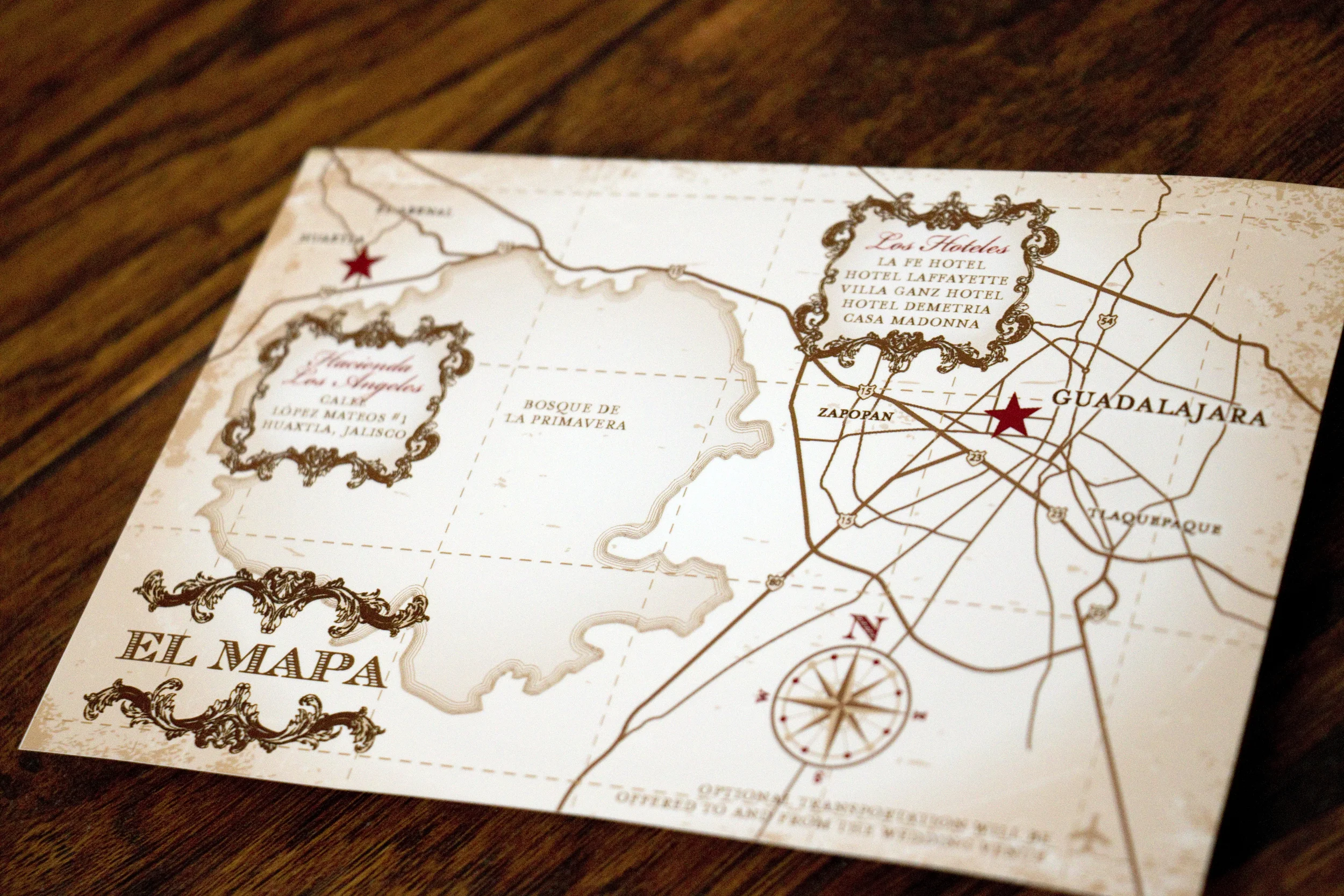
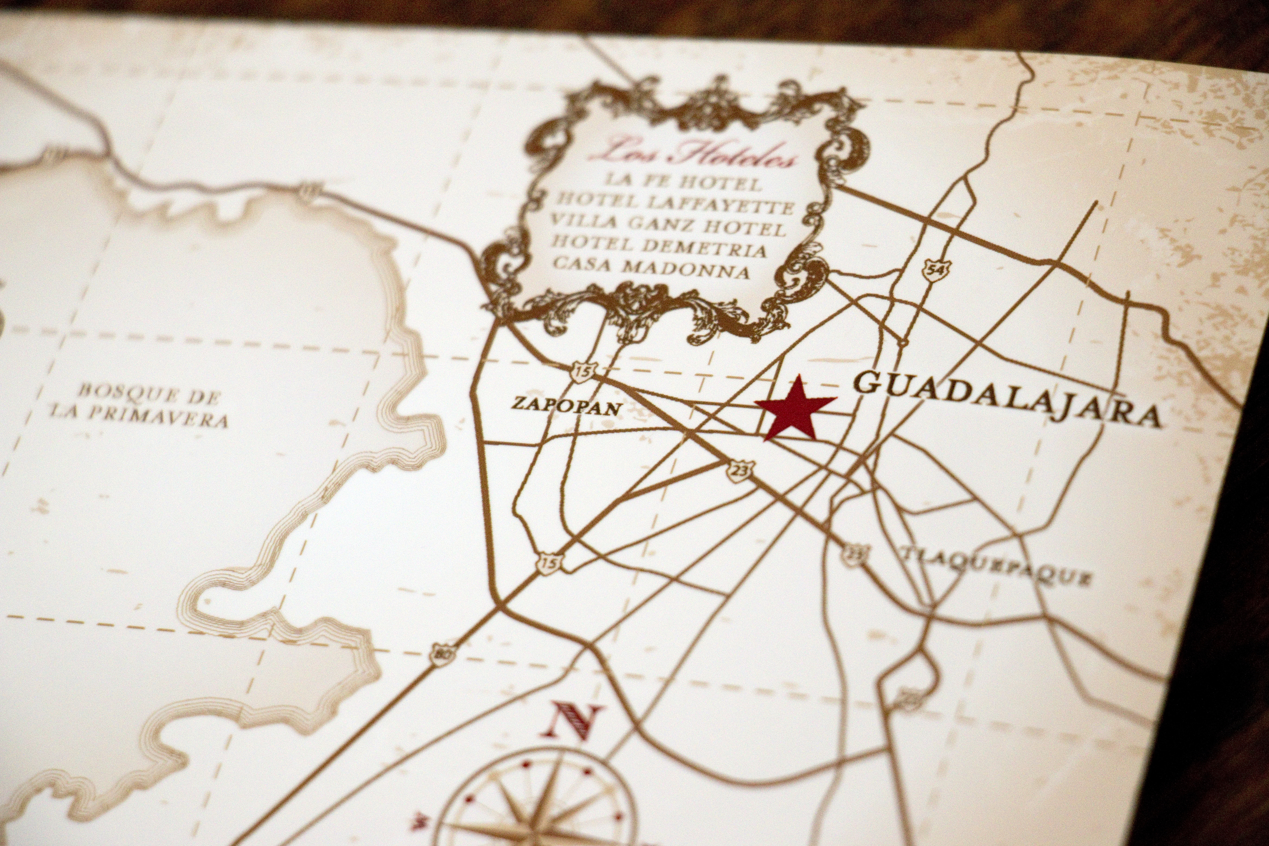
Latiffe asked me to make the map to look a little like a vintage treasure map and I was happy to oblige.

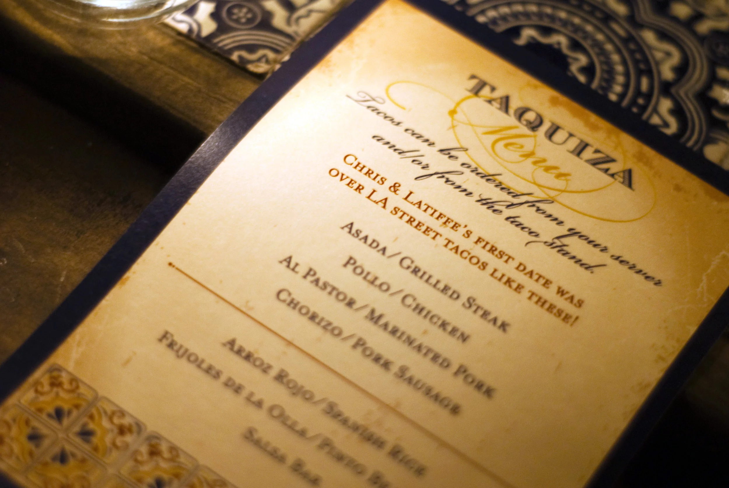
At the wedding reception, they had a taco stand making street tacos for their guests, and I created a menu that sat at each place setting. Photo Cred: Rocio Luna Weddings

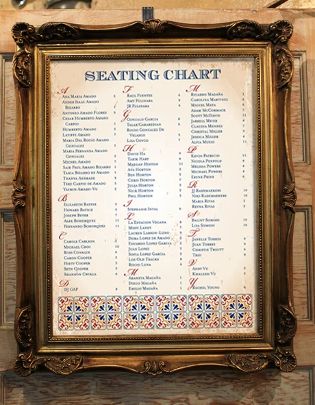
We also created a large seating chart that let guests know where to sit. We weren't able to get a photo of it at the wedding, but this is a mockup of what it looked like:

The wedding looked absolutely gorgeous and it's one I wish I could have attended in person! Congratulations guys!!

Ashleigh's Bridal Shower

Ashleigh's friend, Tamera went all out when it came to her beautiful bridal shower brunch. Tamera wanted to use bright colors, flowers and some references to rain and umbrellas. This is what we came up with:

The invitation was printed square and mounted on petal fold enclosures. The bright green really looked pretty against the pink, orange and yellow.

We carried the floral graphics and fonts into a variety of signs, including a welcome sign.

On the water bottle label, we touched on the "shower" theme with the umbrella. The graphic of the umbrella was Tamera's original inspiration for this brightly-colored bridal shower.

Custom napkin rings. A super simple detail that can add a little extra. 

Small flags were adhered to bamboo skewers to identify food at the buffet table.

Fizzing bath soaps were one of the party favors.

Guests were asked to leave marriage advice for the bride-to-be. These were saved and put into a scrapbook for Ashleigh.

This sign adorned the candy buffet table.

One of a few different shower games included this trivia game about the bride and groom.

There was also a rousing round of Bridal Shower BINGO. 

Tamera really went all out with the beautiful and colorful details for Ashleigh's bridal shower. It was really a treat to get to create so many unique items. I hope the party was amazing, congrats!

Jackie & Michael

My little sister got hitched back in October and it was only natural that I would design the printed items for her beautiful, southern California wedding. She wanted her main colors to be navy blue and ivory with lots of lace. Accent colors were a Fall palette in orange, red and gold. Her wedding gown and the bridesmaid gowns had lots of lace too.

First, for a save-the-date, we paid homage to how Michael proposed to Jackie. 

He convinced her they were participating in a road trip scavenger hunt that took them all over southern California and then up the coast to northern California. They ended the hunt and spent the weekend with our parents where he got down on one knee and popped the question in front of our family... and admitted that the scavenger hunt was a ruse and an excuse to drive up to the Bay Area.

Every red dot represents a stop on the scavenger hunt.

On the back I turned the silhouette of the state into a photo collage from when Michael proposed.

When it was time to design invitations, Jackie wanted to use lace along with their colors. She loved the invitations I created for Erin & John and wanted a similar vibe. 

We went with gate fold cards in Cobalt from Cards and Pockets and they were held closed by a circle that we designed using the same lace motif.

Michael requested that I include a graphic of a samurai sword to represent the honor code he follows with martial arts. He and his groomsmen all carried swords in the wedding ceremony too, it was pretty rad.

For the big day itself, we created a lot of fun items! First, each of the guest tables was named after a submission move in jujitsu. Jackie and Michael posed in each move and took photos of them all, with Jackie in the winning position. 

The rest of the photos from this post were taken by the very talented Katie Jackson

Then, we printed escort cards for each guest directing them where to sit. The folded cards were color coded to indicate to the catering staff what menu item they were having for dinner.

Jackie (a Lifetime Girl Scout) wanted the favors to be Girl Scout Cookies and Michael was more than happy to agree. They each chose their favorite cookie (Thin Mints and Samoas) and placed a couple in individual boxes, each with their own unique label. 

"Love Samoa" and "Mint to Be," get it?! 

This was the sign that adorned their sweetheart table.

We created a bunch of signs that were placed throughout the reception venue:

Side note: Jackie and Michael had no idea what they wanted to use for a guestbook. They weren't thrilled about a book that just listed everyone's names, and they don't have space in their home to hang a big print on the wall with everyone's names. I told her I'd take care of it (two weeks before the wedding!). I took all of the engagement photos taken by Katie Jackson and made them into a photobook that had lots of white space on the pages, like a yearbook. That way people could leave their well wishes wherever they wanted. With a coupon through Shutterfly the book was less about $35. This is by far, my favorite way to do a guestbook. I did it for my wedding and I still sometimes thumb through our book almost 10 years later.

Back to photos!

A table set aside in memory of the family and close friends who couldn't be there. This is what the sign says:

In Loving Memory
Those we love don't go away,
They walk beside us every day.
Unseen, unheard, but always near,
Still loved, still missed,
And very dear.

"Life is Short, Eat Dessert First" Jackie doesn't care for cake, so they had wedding pie!! The light-up letters were a last-minute thing too, I love how they turned out!

It was truly an honor to get to design all of these for my little sister and I'm so thrilled with how it all turned out. It was an honor to stand beside you as you said "I do," congratulations!!

A last little gem from Katie Jackson, she really captured our relationship here. Hahaha!

Raquel & Mark

I had the privilege of working with Raquel on the invitations for her wedding a few months back. She and Mark were planning a destination wedding at the Hard Rock Resort in Cancun, Mexico.

First we did a fun safe-the-date. She wanted to incorporate a little bit of a concert poster vibe and also let her guests know they if they were planning to come, they needed to book their trip as soon as possible. 

Can you see their adoring fans, subtly in the background of their sunset. The reservation information has been changed to protect privacy.

When it was time to create their wedding invitations, they wanted to incorporate ocean life in watercolor and have it look very elegant. I really love how they turned out!

The upgraded their printing and had the gold text printed with metallic gold foil. I LOVE how it turned out!!

We did a simple RSVP card that directed guests to share their responses on the couple's wedding website. I changed their website URL to protect privacy.

Lastly, I created a simple coral graphic that they had printed in gold foil on the back of their gold envelopes. This was such a subtle detail that I really love. And yes, I changed their address in Photoshop. 

I am so in love with how this invitation turned out, it almost makes me want to plan another wedding. Almost. 

Congratulations Mark and Raquel, I hope your Cancun wedding was amazing!!

Kari & Nathan

My cousin, Kari and her fiancé, Nathan were planning a destination wedding in Kauai and they loved the invitations I created for Joanna and Matt. So we stuck with the same basic design and added elements to make it their own. 

Everything was printed on linen card stock by Cards and Pockets. We also created wraparound address labels and the envelopes were from Paper Source. 

Friends and family members who had already committed to attending were the only ones who received an invitation. The inserts included a map to the ceremony and reception. (This was the very first time I saw less-than-stellar print quality come from Cards & Pockets. The blocks of color didn't print as vibrant as they should have.)

There was also an invitation to attend a luau with the bride and groom and their family in lieu of a traditional rehearsal dinner.

The back showed a map on how to get there.

This was one destination wedding I was thrilled to get to attend!

The long tables were decorated with orchids and ripe pineapples that smelled amazing. At each place setting was a menu that I designed with their graphics and an engraved luggage tag that served as both a place card and a wedding favor. Each guest's initials were engraved on the back of the luggage tag.

It was an absolutely GORGEOUS wedding and such an honor to get to contribute a little, take some photos, and share the special day with Kari and Nathan. 

Congratulations!!